Grundschule am Koppenplatz
Corporate Design
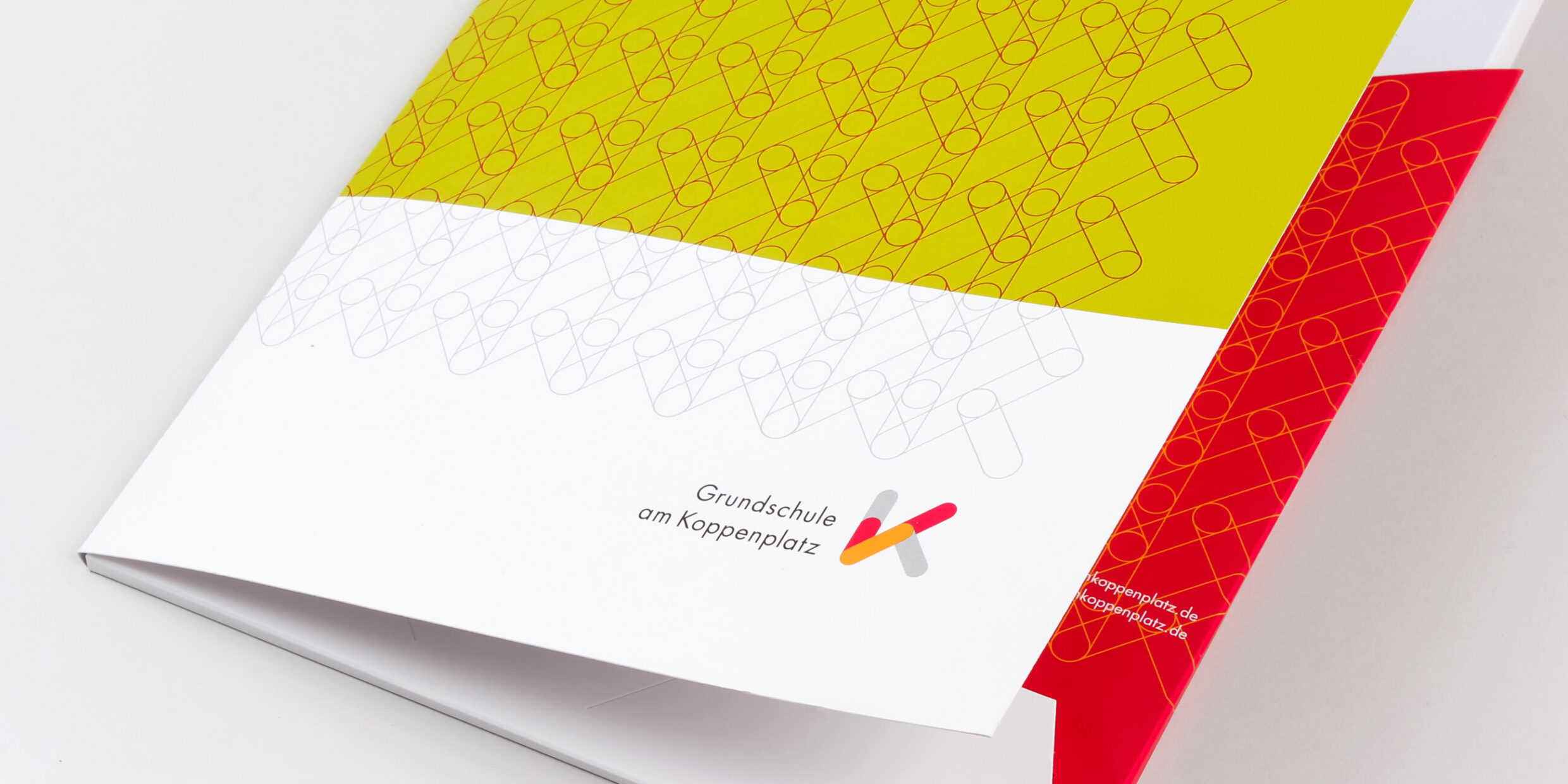
The basis for teaching and learning at Koppenplatz Primary School is the concept of elementary learning architectures, of the methods of creating knowledge through discovery and application. The children experience the world from different perspectives, such as mathematics and natural sciences. The school is situated at three locations in the centre of the city. To visualise the brand networking: the three locations, the individual fields of knowledge, the teachers and the parents. A “K”, constructed from individual lines, stands for Koppenplatz, Children (Kinder), Culture (Kultur) and Communication (Kommunikation). The logo colours are bright and friendly. The combinations vary, and together with other elements, create an open, colourful appearance, like a city map under a magnifying glass.
The project originated as a cooperation among parents, working closely with the management of Koppenplatz Primary School.
Corporate Design
Logo
Information flyer
Folder for parents
Berlin 2013
In cooperation with
Hanno Bäucker und Georg Schönwandt
Website
Lilli Artmann
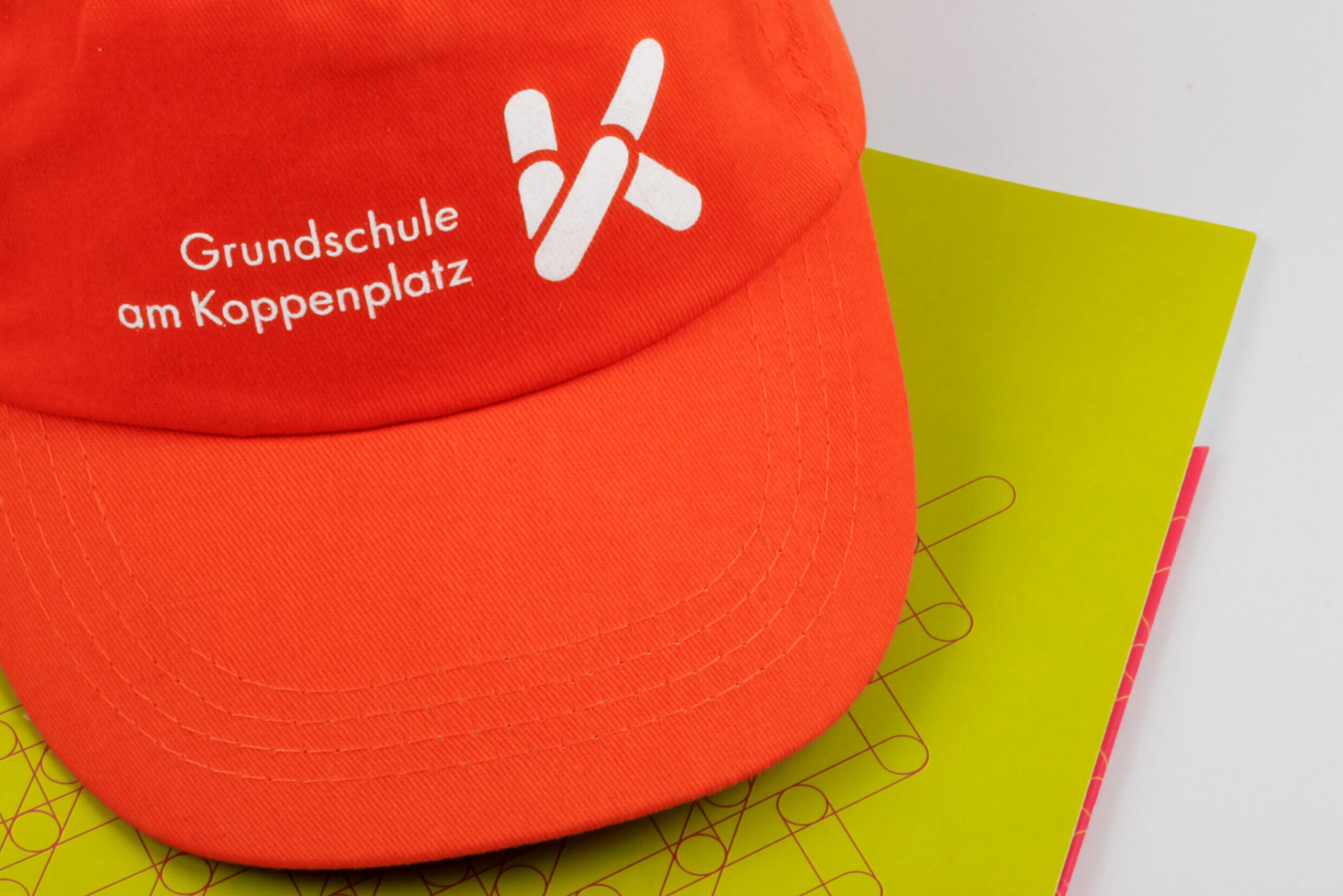
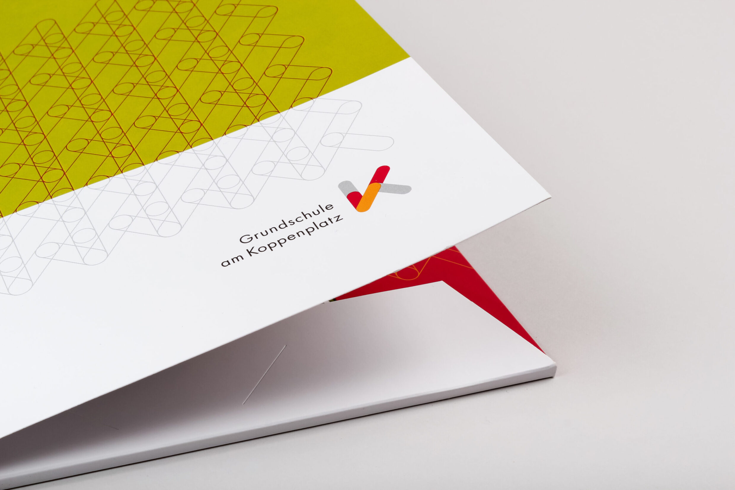
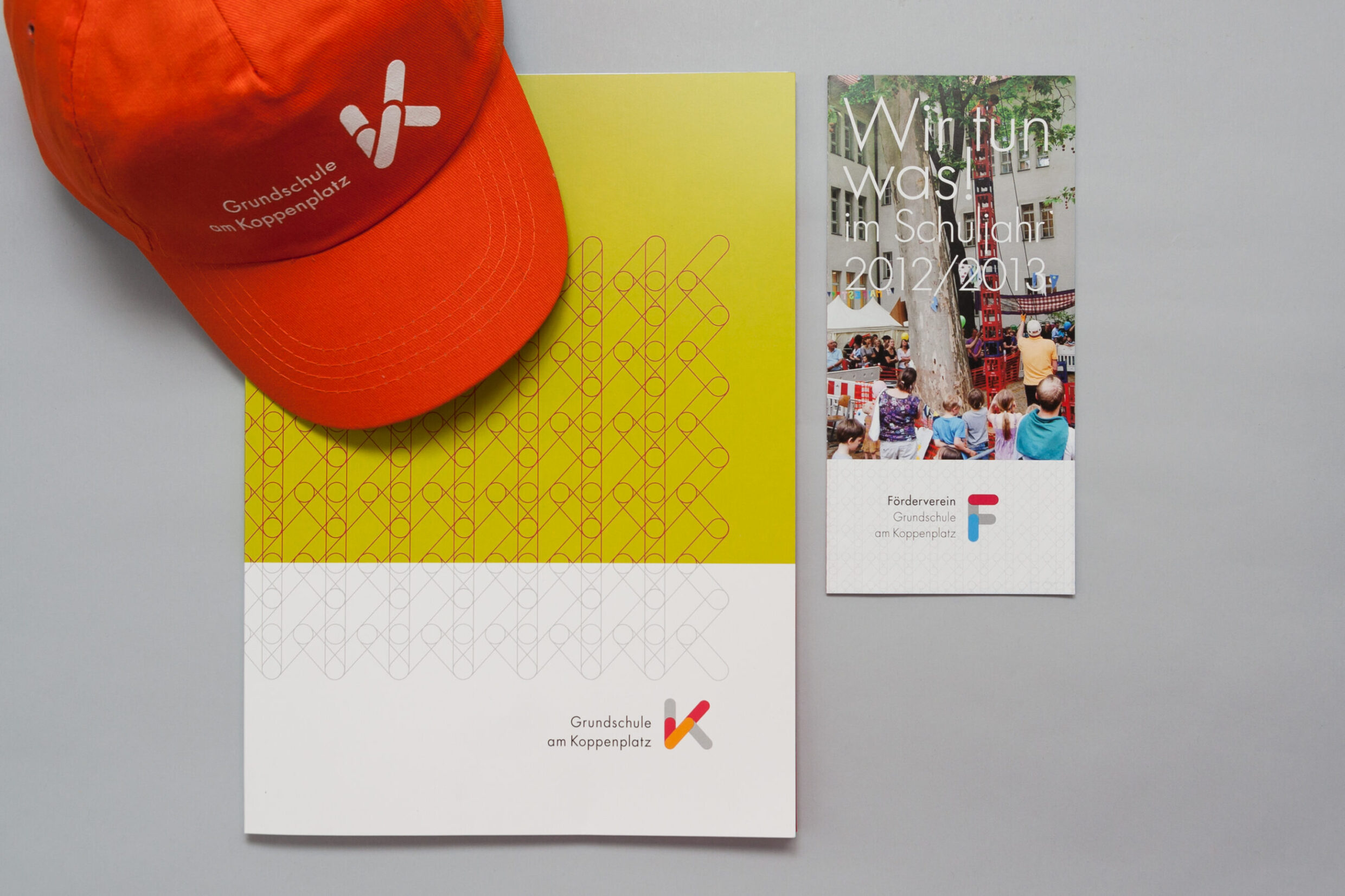
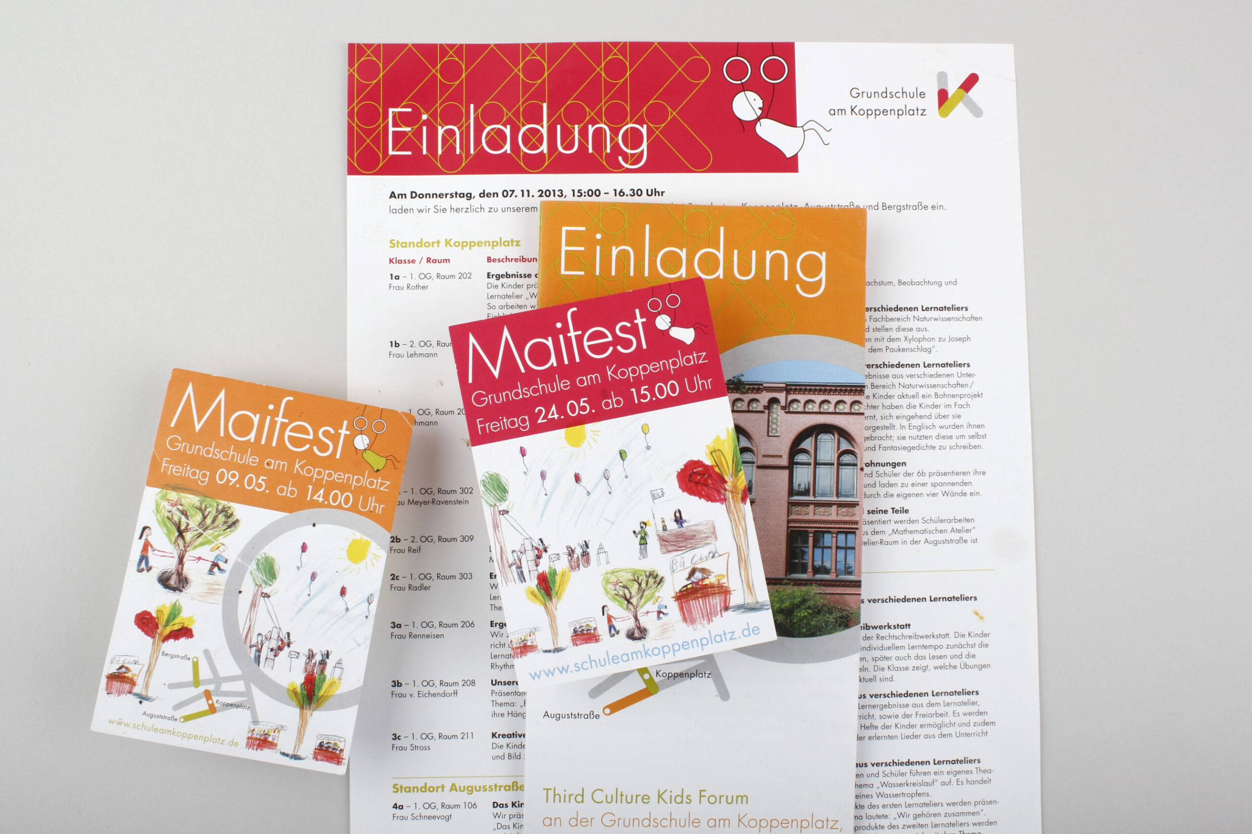
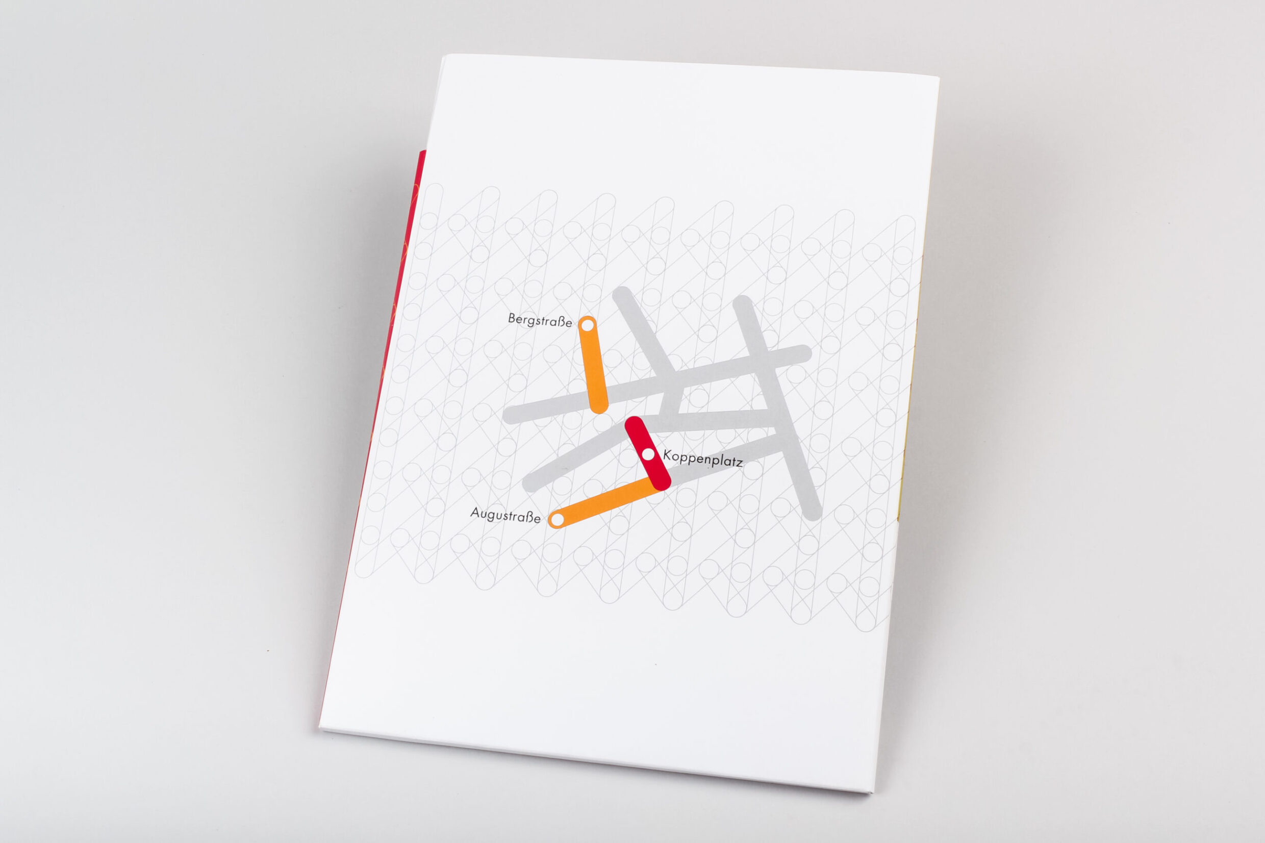
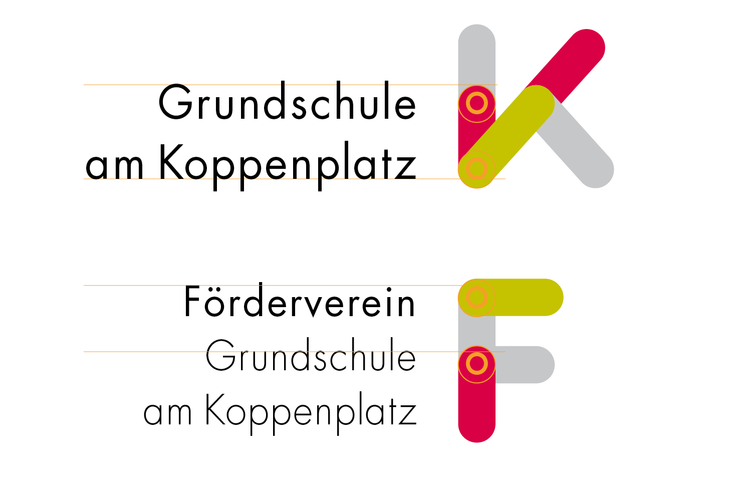
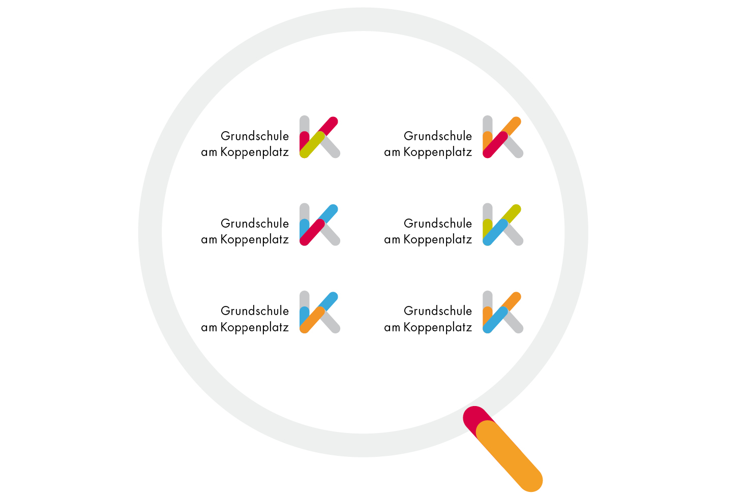

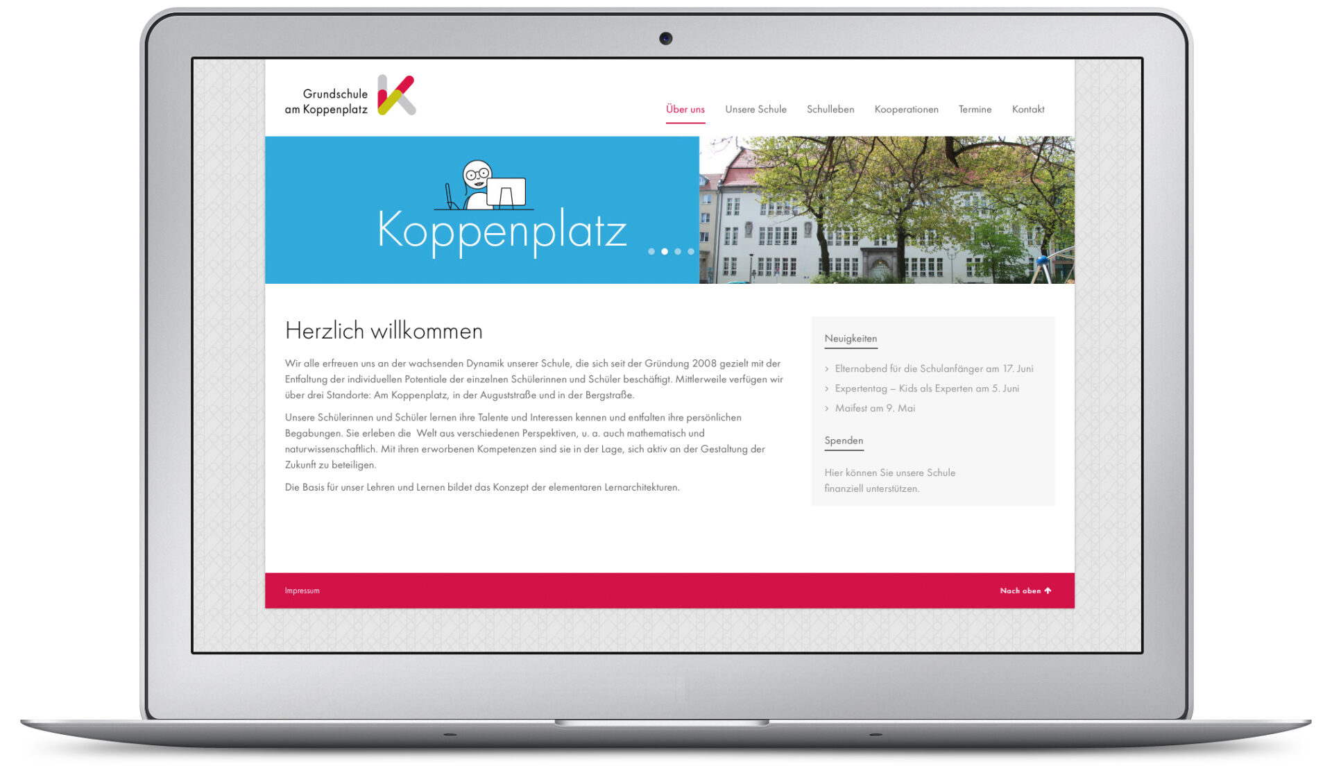

Photo: Anke Dall
