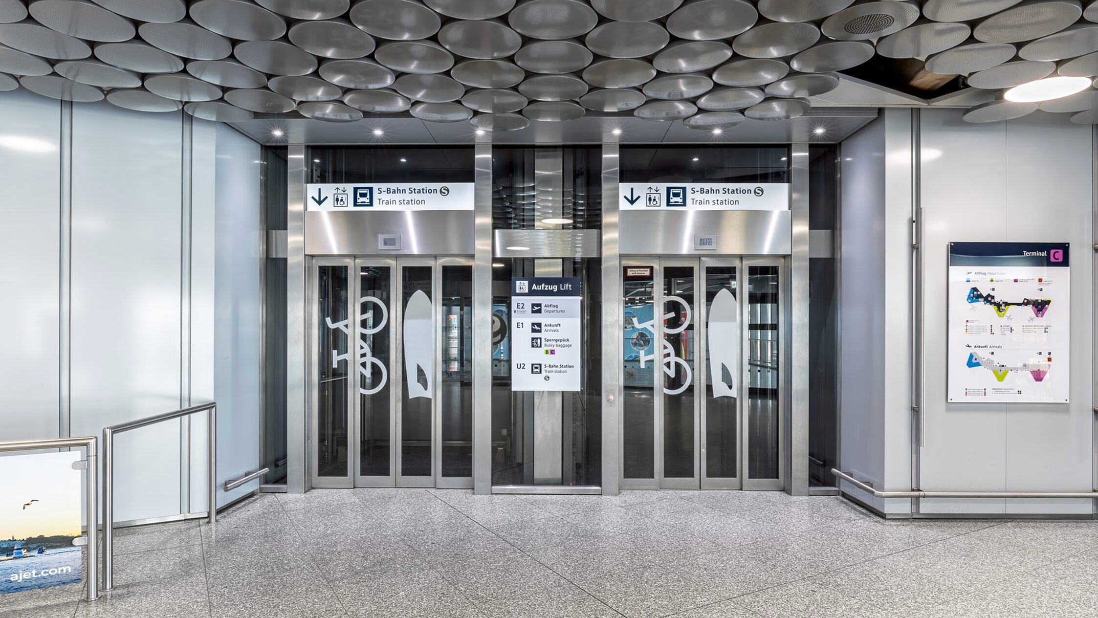
Hannover Airport
Wayfinding System
Hanover Airport is Northern Germany’s primary gateway for holidaymakers and business travelers. In recent years, the airport has undergone extensive modernization. As part of this process, Moniteurs was commissioned to develop and implement the wayfinding system. The new spatial integration of the terminals, additional services and commercial offerings, as well as the increasing digitalization of information media, placed high demands on a consistent and future-ready wayfinding system. The goal was to create an orientation experience that is not only functional, but holistic, clear, intuitive, and seamlessly integrated across all media.
Wayfinding and orientation system
Hannover 2025
Client
Hannover Airport
Area
308.000 qm
Photos
Stefan Schilling
Capacity PAX per year
6,4 Millionen

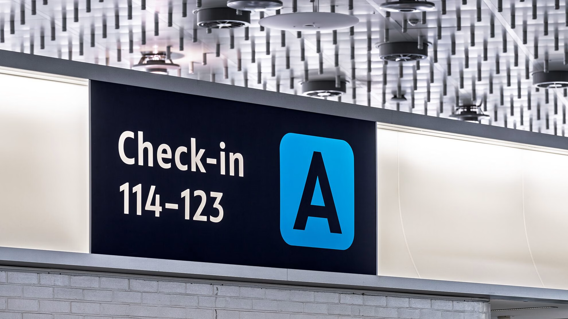
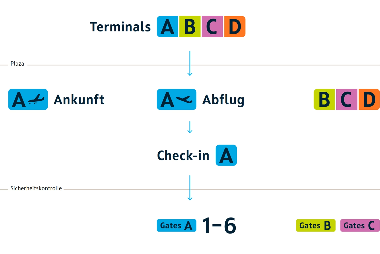
The wayfinding system combines functionality with identity, creating a unifying design framework for the entire Hanover Airport. Its naming system, language guidelines, and wording catalogue provide the foundation for a coherent, cross-disciplinary planning approach. The core elements of the wayfinding system — color, typography, pictograms, product design, and consistent content — carry the identity of Hanover Airport throughout all terminal buildings and the surrounding outdoor areas.
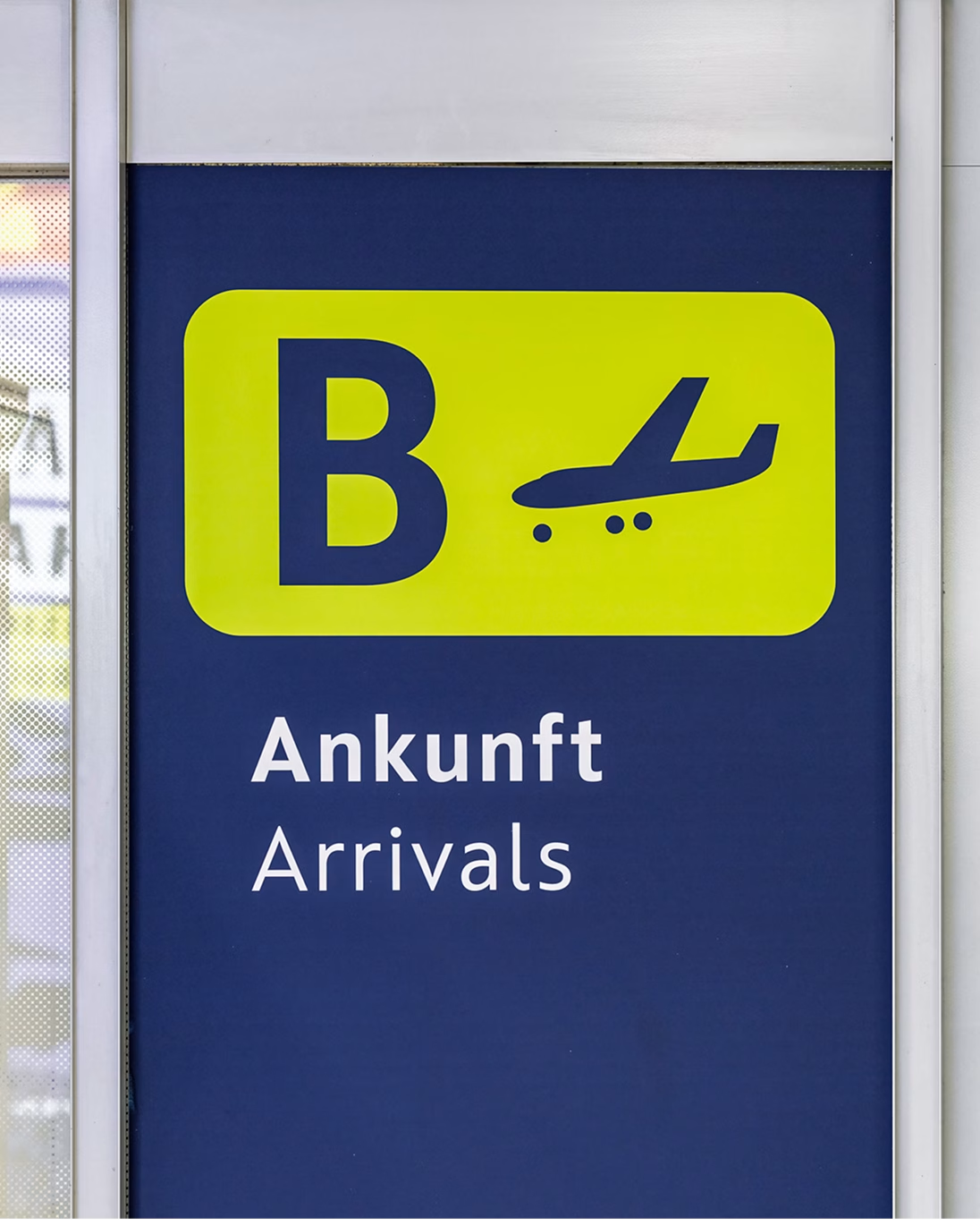
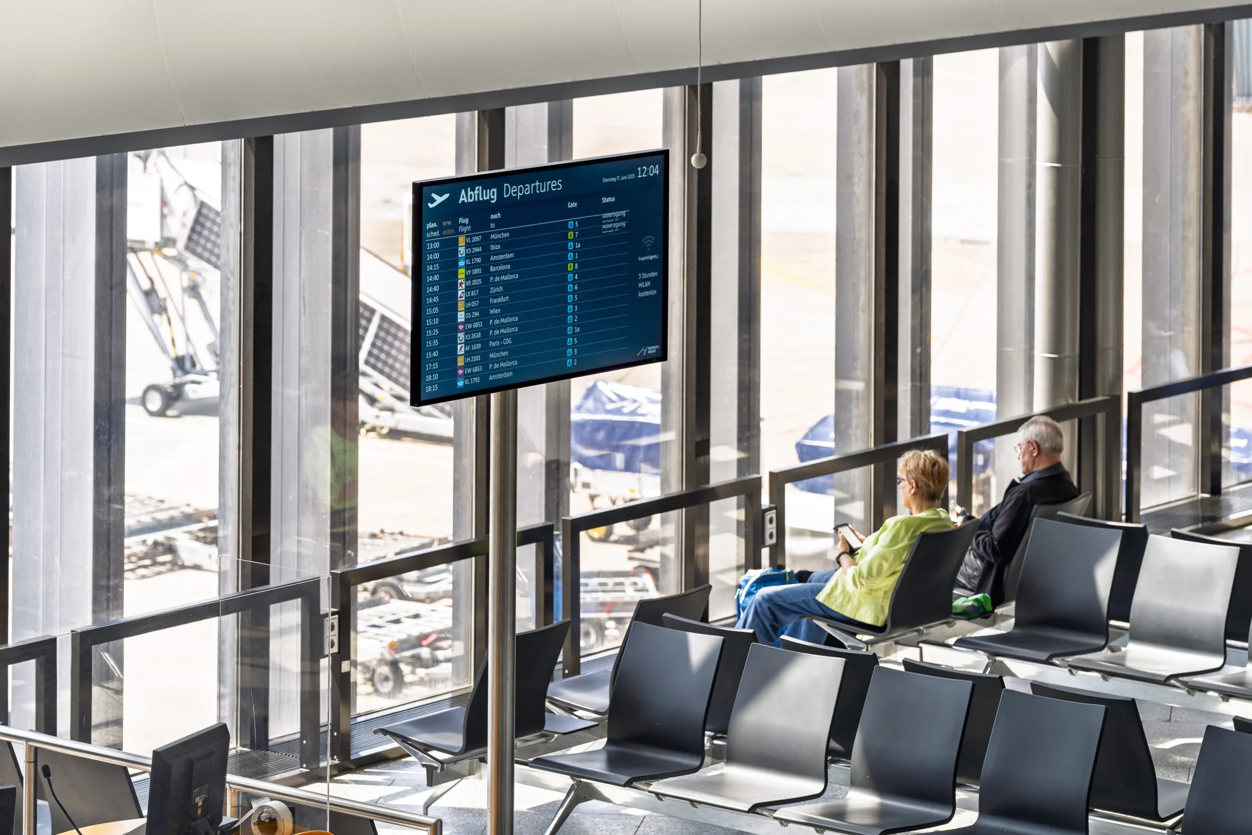
A consistent and seamless chain of directional, identifying, informational, and orientational elements, across both interior and exterior spaces, guides every user group. From the approach roads to the airport grounds, through parking information and onward to the terminals, and from there through the terminal buildings to the gates, it provides passengers with reliable and effortless orientation.
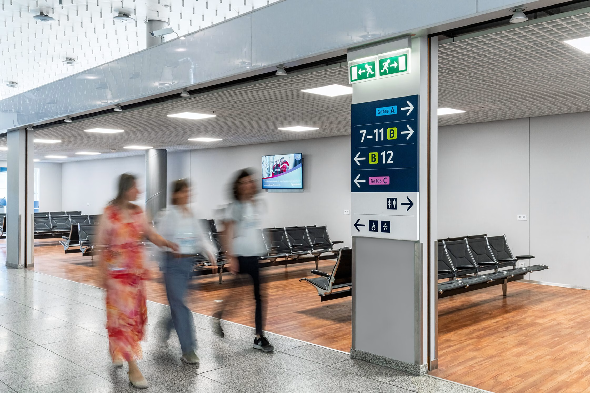
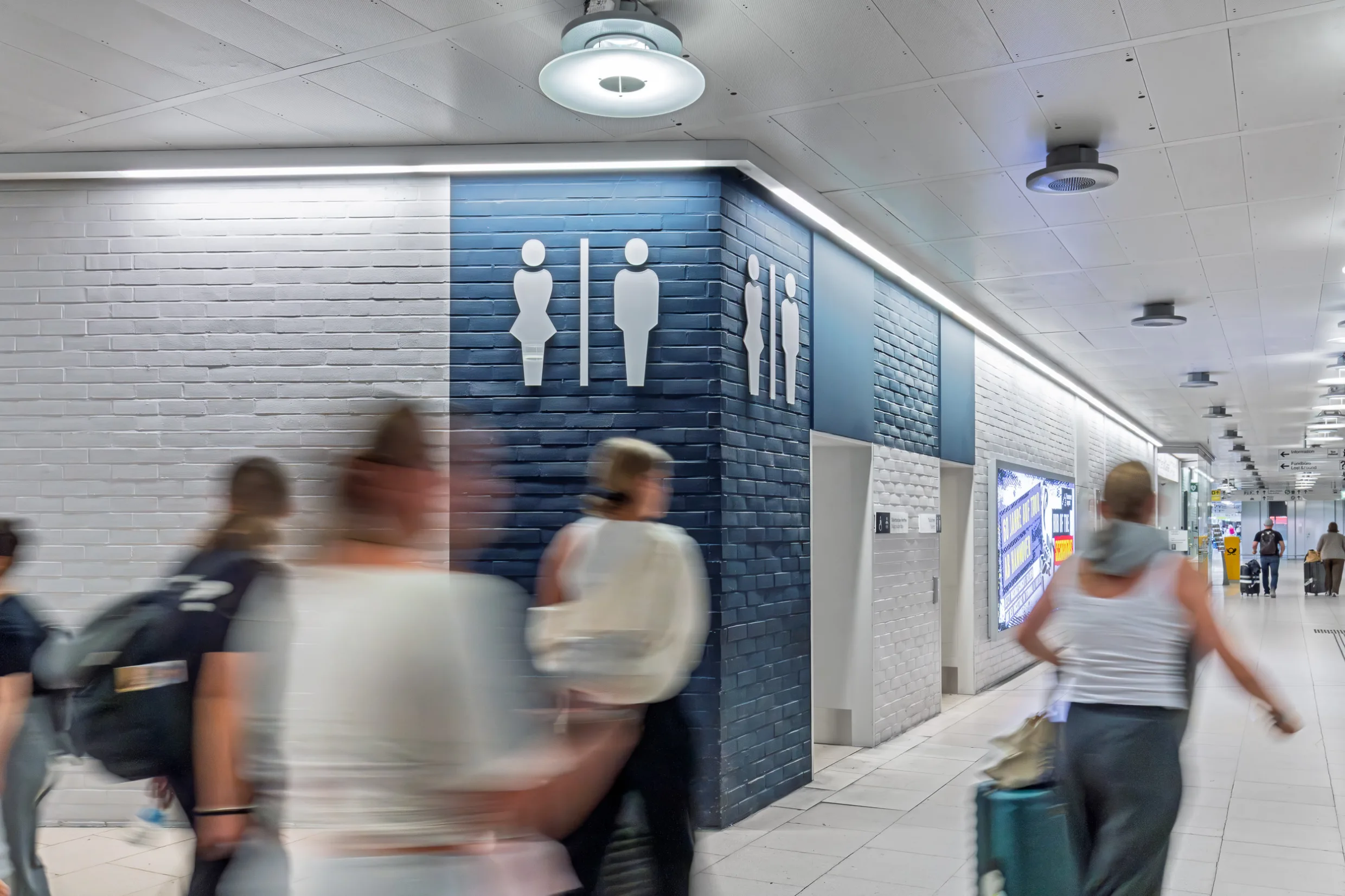

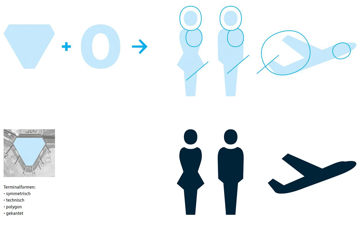
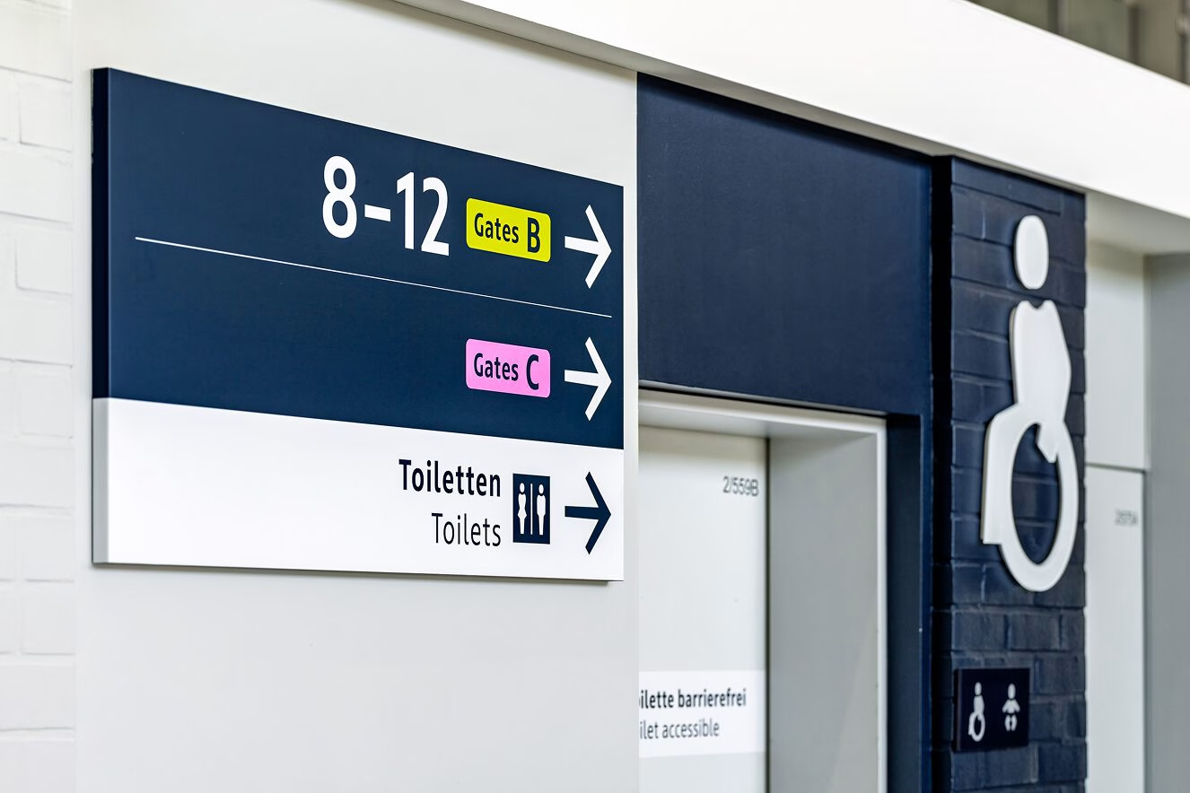
The visual language of the pictograms is derived from both the airport’s architecture and the typeface used throughout Hanover Airport’s wayfinding system. For example, the letter “o” serves as the basis for all curved forms within the pictograms, while diagonal lines and angles echo the polygonal architecture of Terminals A, B, and C.