Flughafen Berlin Brandenburg
Orientation System Terminal
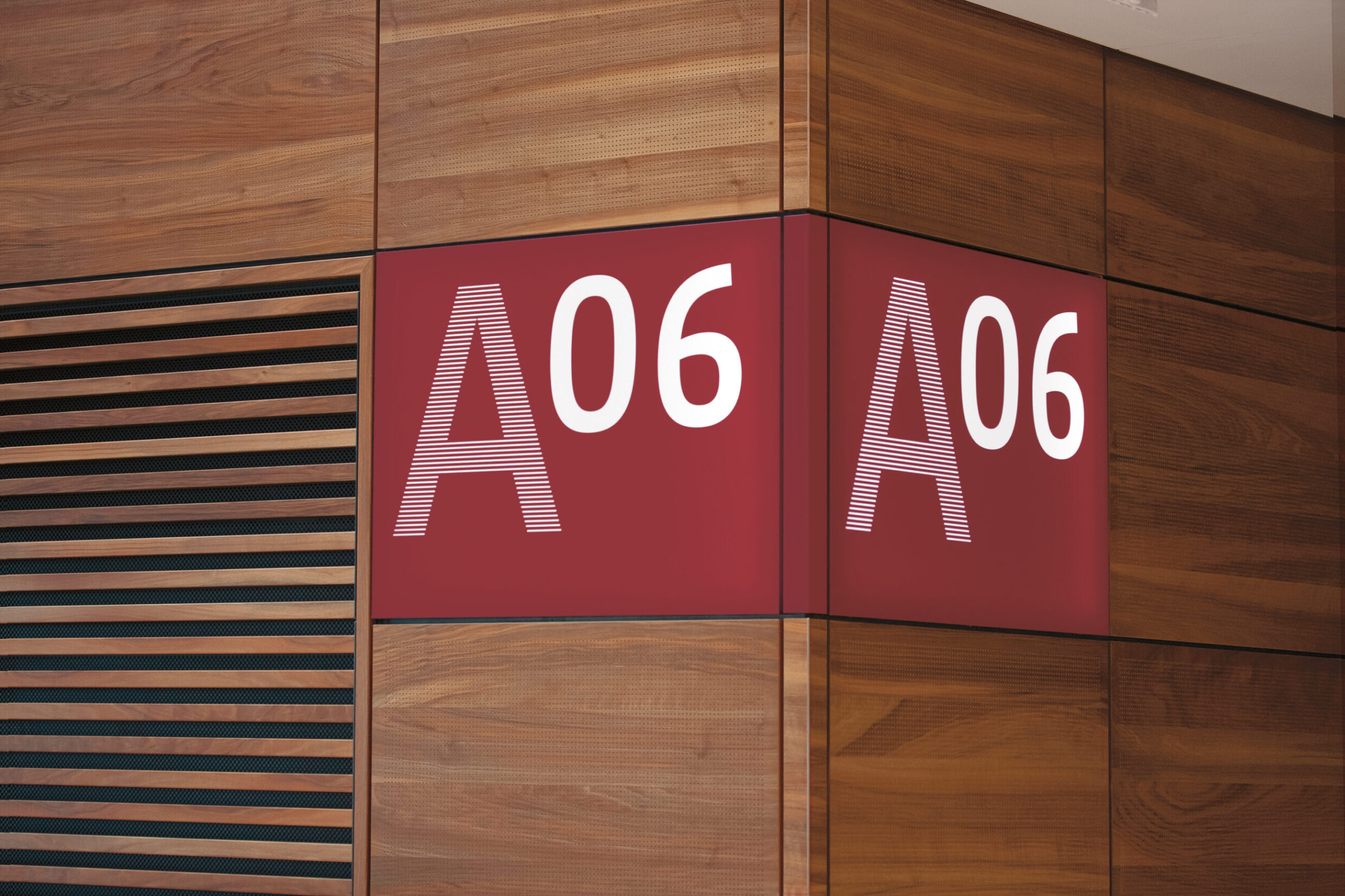
The Berlin Brandenburg Airport is one of the largest and most complex transport infrastructure projects in Germany. The building was designed by the renowned architects gmp and JSK International. Moniteurs was already actively involved in the project at the competition phase for the communications design, and by degrees was commissioned to design the orientation system for the airport including its surroundings. A key design feature is the colour red, unusual for airports. This gives clear signals for orientation, and also harmonises with the architecture, with its warm tones of wood and natural stone. At the same time, it is modelled on the appearance of its home states of Berlin and Brandenburg. In many places, the signs are directly embedded into the architectural panels – some flow around the corner, and this concept is woven into the product design of the signs outside the building.
Orientation and Guidance System, Interior
Public and restricted areas
Terminal, car parks
Berlin 2020
Client
Flughafen Berlin Brandenburg GmbH
Planungsgesellschaft BBI, pgbbi
since 2005
Architecture
gmp Architects
von Gerkan, Marg and Partners
and J·S·K Architects
HENN Architects (car parks)
Area
280,000 m2 Building
Capacity PAX per year
30 Million
Awards
Iconic Awards 2021, Winner


A further element dovetailing the orientation system and the architecture is the lines of the individual graphical elements of the orientation system. Moniteurs adopted the linear structures of the architecture, themselves based upon the coniferous forests of Brandeburg, something which has also inspired some modern buildings of Berlin, such as the New National Gallery by Mies van der Rohe. The lines that make up the letters and pictograms produce graded tones, which create a hierarchy among the signs without having to be colourful. In this way, the information is well-structured and easily readable. The content structure has been just as clearly configured: the pictogram of the departing aircraft accompanies passengers to security, after which the signs for gates A – D become visible. As the architectural language varies from one part of the building to another, so too does the graphical language of the orientation system. In the North Pier, for example, where the wall fixtures are not made of wood, passenger information is applied directly to the walls. This variety of applications illustrates once more the strength of the clear, integrated design concept.