Slanted 18 – Signage/Orientation
Interview with Moniteurs
Lars Harmsen: Can you tell us a few things about your fundamental principle that an orientation system has an identity, a character, and cannot be totally neutral?
Moniteurs: However an orientation system is designed, it carries with it an identity. Today you have an opportunity to shape it consciously – and you have to! It’s not like in the 70’s: then, all the signs were just painted yellow. These days, it’s possible to differentiate much more and the airports have to, because they’re all in competition with each other; they have to distinguish themselves in order to battle for the airlines and the passengers.
by Lars Harmsen
with Sibylle Schlaich and Heike Nehl, Moniteurs
Published
2012
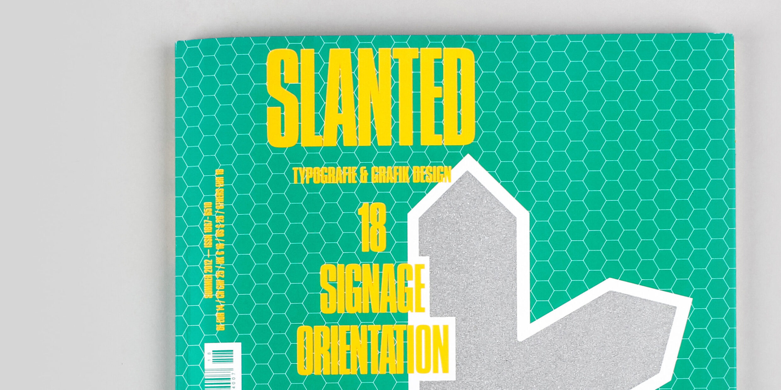
Slanted 18 Signage / Orientation
What is striking is that you cannot usually recall airports properly. They are so often like hotel rooms – they are uniform and they all look the same. Would you agree with this statement? Have you taken on the task of working on this deficit of individuality?
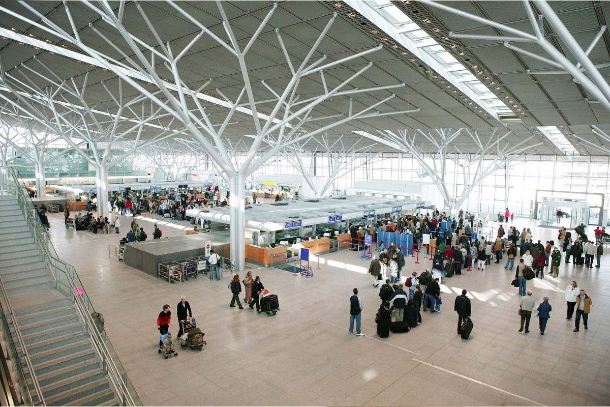
Yes. What is fascinating is that you know the architecture of some airports – but only from the media. Rarely do we perceive these airports ourselves. We step into one gate and come out of another. We think that globally airports are becoming more individual – for example in India, there are terminals with elephant and Buddha statues. We think that it’s not only the architecture, but also the orientation system, that gives the airports a face. For example, Lleida Airport in Catalonia: the interior design of the airport brings in a completely new atmosphere, entirely its own.
Your concept for the Berlin Brandenburg Airport “married” the orientation system to the architecture. How did that concept arise?
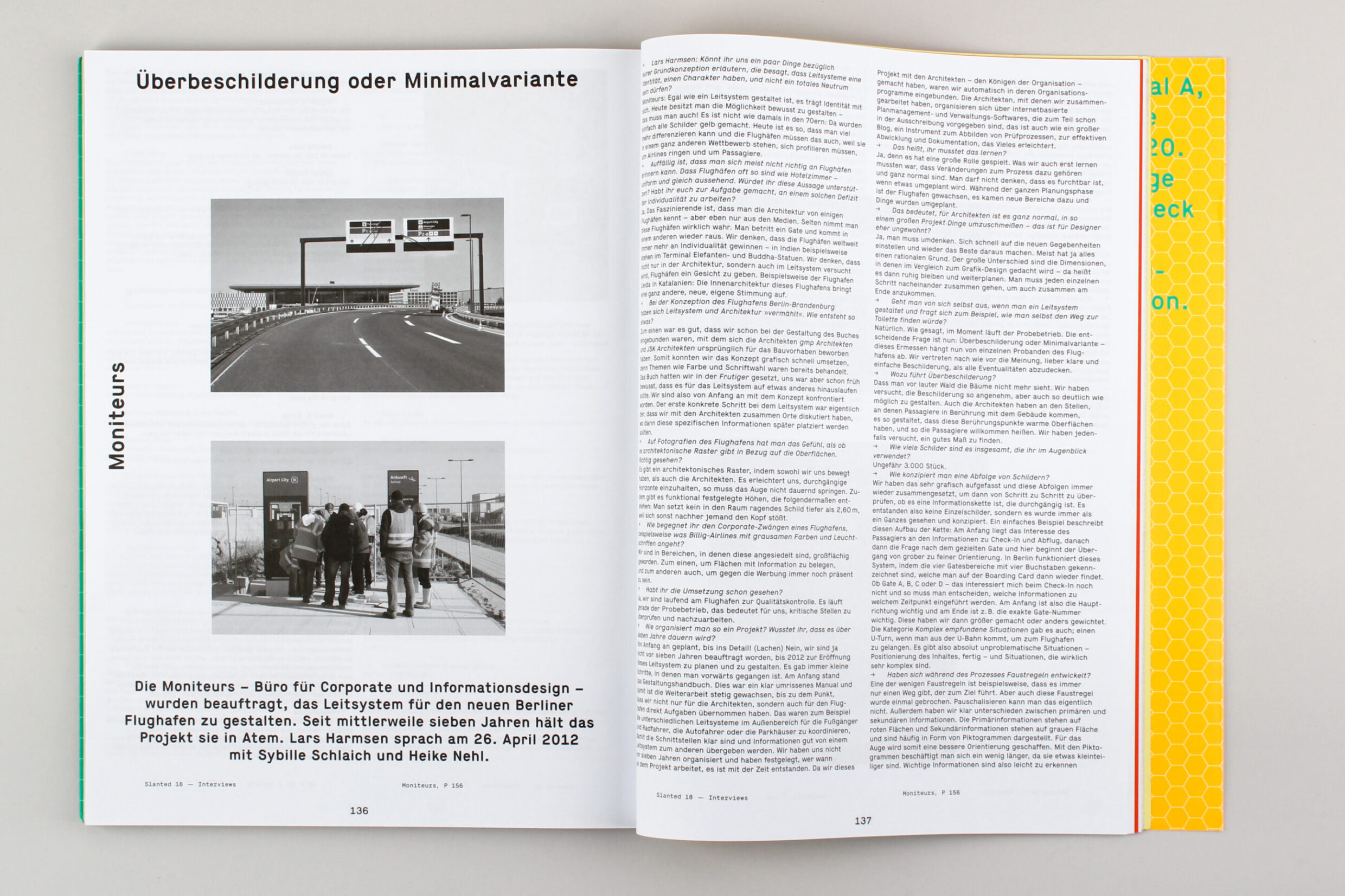
For one, it was good that we were already involved with the architects gmp and JSK to create a book originally designed to promote the construction project. So we were able to implement the graphic concept quickly, because the issues such as colour and font selection were already dealt with. We did the book in Frutiger, but we knew early on that for the orientation system it should amount to something else. From the beginning, we were already faced with the concept. The first concrete step with the orientation system was actually when we discussed the locations with the architects about where specifically this information would later be placed.
From the photographs of the airport, you get the feeling that there is an architectural grid with respect to the surfaces. Is that correct?
There is an architectural grid that both we and the architects instilled. It helps us to have continuous horizons so that the eye does not have to constantly jump. There are also functionally defined heights, resulting as follows: you cannot place a sign in a space lower than 2.6m, otherwise somebody will hit their head.
How do you meet the corporate demands of an airport, for example the ghastly colours and neon signs used by low-cost airlines?
We are in an area where these have become extensive. On the one hand, we try to present the information, and on the other, to prevent the adverts from becoming ubiquitous.
Have you seen the implementation yet?
Yes, we’re constantly at the airport for quality control. It’s currently undergoing a test run, which for us means testing critical points and making modifications.
How do you organise such a project? And did you know that it would last over seven years?
From the beginning, planned down to the last detail! (Laughter) No, seven years ago we weren’t even asked to plan and design this orientation system up to the opening. There were always small steps in which you went forward. At the beginning there was the design manual. This was a clear-cut manual which allowed further work to grow steadily up to the point where we were taking on work not just from the architects, but also directly from the airport. For example, we had to coordinate the different orientation systems for the outside, for the pedestrians and cyclists, for drivers and the car parks, to ensure that the interfaces were clear and the information carried well from one system to the next. Seven years ago, we had not organised and decided who would work on the project and when – it emerged over time. Because we were doing this project with the architects – the kings of the organisation – we were automatically included in the organisation programme. The architects we worked with organised everything though internet-based plan management and administrative software, an instrument that facilitates visualisation and verifying processes, and effective management and documentation.
That means you had to learn it?
Yes, because it played an important role. What we also had to learn was that changes to the process often happen and are quite normal. You can’t think that it’s terrible when something is rescheduled. During the whole planning phase the airport grew, it moved into new areas and things were rescheduled.
Does that mean that for architects, on such a large project, it is completely normal to change things around, but for designers it is rather unusual?
Yes, you have to rethink. Adjust quickly to the new conditions and make the most of them. Most things have a rational reason. The biggest difference is the dimensions in which, in comparison to graphic design, you have to remain quiet and continue planning. You have to take every step in sequence together, so that you can arrive at the end together.
Do you ever think, when designing an orientation system, to ask yourself for example if you yourself could find the way to the toilet?
Of course. As we said, at the moment we’re in the testing phase. The key question now is: more signage or a minimal variant – that estimation depends on the individual testers of the airport. We are of the opinion of having clear and simple signs rather than covering all eventualities.
What are the implications of more signage?
That you can no longer see the wood for the trees. We have tried to make the signs as pleasant as possible, as well as clear. Even the architects have designed the places where the passengers come into contact with the building to have warm surfaces and so make the passengers feel welcome. In any case, we have tried to find a good balance.
How many signs in total have you used?
Around 3,000 pieces.
How do you design the sequence of signs?
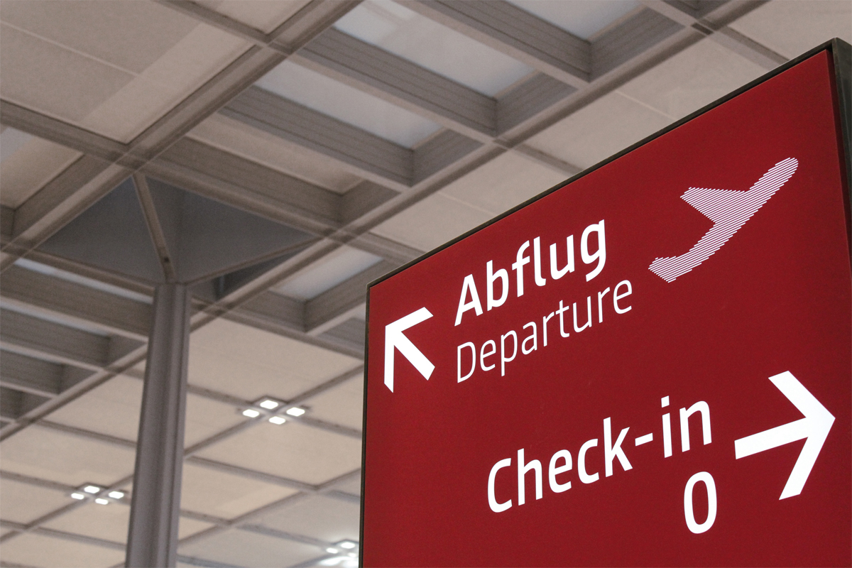
We always understood the graphics and the sequence together, and then we checked step by step whether there is a continuous chain of information. So there were no individual signs, but rather they were always seen and designed as a whole. A simple example illustrates this construction of the chain: at the beginning, the passengers’ interest lies in the information concerning check-in and departure, and after that the particular gate, and here begins the transition from coarse to fine orientation. In Berlin, the four gate areas are identified by four letters, which you can then find on the boarding card. Whether Gate A, B, C or D – I’m not interested in that at the check-in, and so you have to decide which information to introduce at which time. So at the beginning, the main direction is important, and at the end, for example, the exact gate number is important, and this we have either made larger, or weighted differently. There was also the category “Complexly perceived situations”: a U-turn when you come out of the underground and reach the airport. And there are also completely unproblematic situations – positioning of content, done – and situations that are really very complex.
During the process, have you developed any rules of thumb?
One of the few rules of thumb is, for example, that there is only one path which leads to each destination. But even this rule of thumb was sometimes broken. You cannot over-simplify.
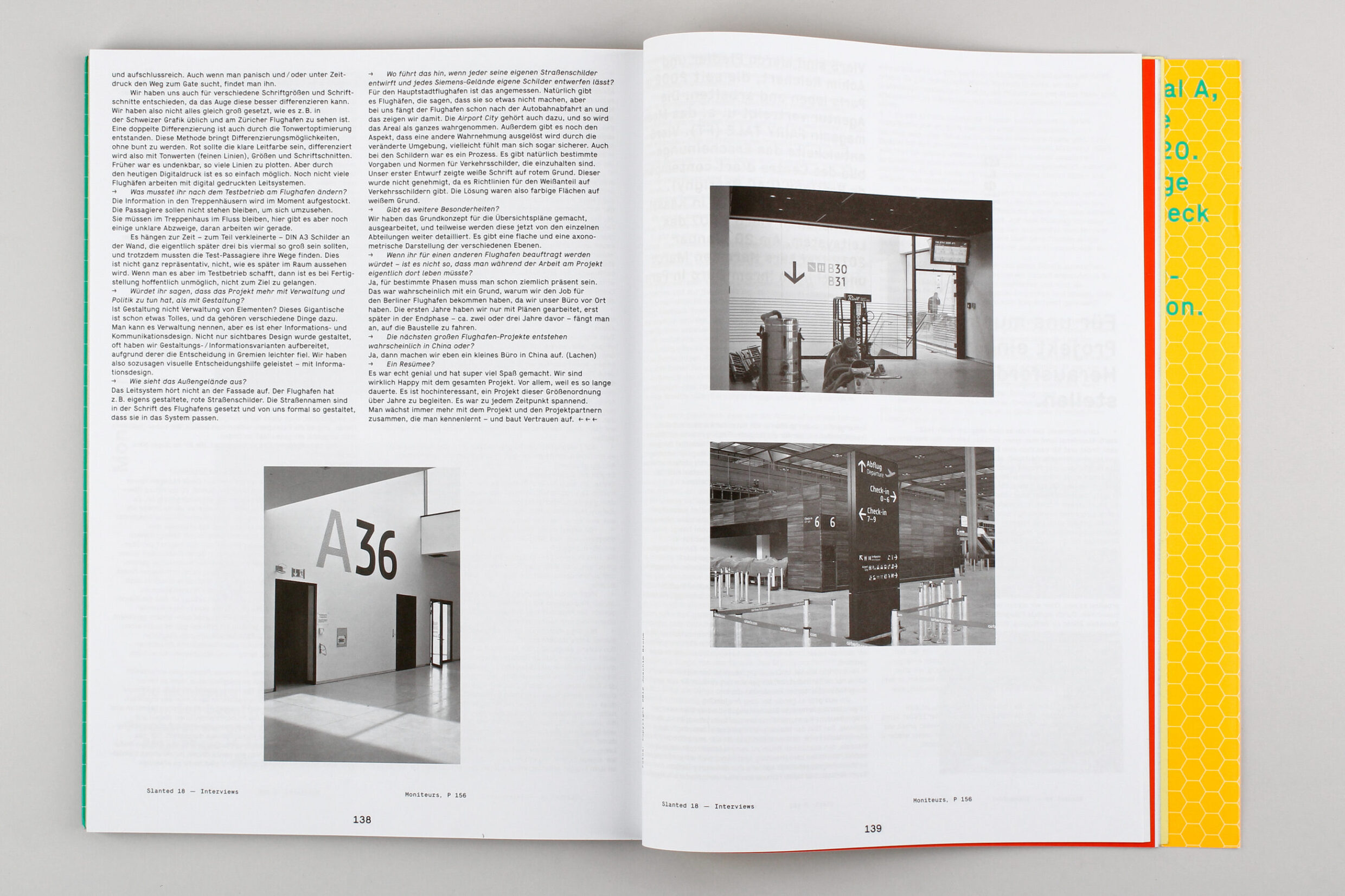
Furthermore, we made a clear distinction between primary and secondary information. The primary information is on red areas, and the secondary information is on grey areas and often shown in the form of pictograms. Thus, a better orientation is created for the eye. You occupy yourself a little longer with the pictograms because they’re slightly smaller. Important information is therefore easy to recognise and informative, and also when you’re running out of time and frantically looking for the gate, you can find it.
We also decided on various font sizes and font families that the eye can better differentiate. So we didn’t set everything at the same size as is common, for example, in Swiss graphic design and what you can see at Zurich Airport. A double differentiation originated through tonal optimisation. This method allows you to differentiate without the need to be colourful. Red had to be the key guiding colour, so it was differentiated through tonal values (fine lines), sizes and font styles. Earlier, it was unthinkable to plot so many lines. But through today’s digital printing it is so easy. Not many airports work with digitally printed orientation systems.
What did you have to change after the test run at the airport?
The information in the stairwells is being raised at the moment. The passengers should not have to stand and look around. They should continually flow through the stairwell, and here there are still a few unclear turns, but we’re working on them. Because of time constraints, some partly reduced DIN A3 signs were placed on the wall that will later actually be three to four times bigger, and despite this the test passengers found their way. It’s not entirely representative, not how it will look in the space later. But if you can manage it in a test run, then when it’s finished, hopefully it will not be impossible to reach your destination.
Would you say that the project is more management and politics than design?
Is design not the management of elements? This giant is already something great and therefore many different things belong to it. You can call it management, but it is more information and communication design. Not only did we create the visible design, but we often prepared design and information variants because they fell more easily under the decisions of certain committees. Therefore, so to say, we accomplished visual aids to decision-making – with information design.
What does the outside area look like?
The orientation system does not stop at the facade. For example, the airport has adopted its own, custom-designed red road signs and not the profane, white signs of the city of Berlin. The street names are in the airport font and we designed them to fit into the system.
What will that lead to, if everybody can design their own street signs and every Siemens complex is allowed to develop their own signs?
For the capital city airport it is appropriate. Naturally there are airports that say they will not do that, but for us the airport already begins after the motorway exit, and that is what we show. The Airport City also belongs here, and so the area is perceived as a whole. There is also the aspect that a different perception is triggered through the changed environment; perhaps you even feel safer. Even with the signs it was a process. There are of course particular guidelines and standards for traffic signs that must be observed. Our first design had white text on a red background. That wasn’t approved because there are guidelines for the amount of white on traffic signs. The solution, then, was colour areas on a white background.
Are there any additional peculiarities?
We took the basic concept of the layout plans, elaborated on them and now to some extent more detail is being added by the individual departments. There are flat and axonometric views of the various layers.
If you were contracted to work on another airport, is it not true that you would then have to live there?
Yes, for certain phases you have to be quite close by. That was probably one of the reasons why we got the job for the Berlin airport, because our office was local. For the first few years we worked only with plans, until about two or three years before the end phase, when we began to travel to the construction site.
The closest major airport projects are probably in China, aren’t they?
Yes, then we’ll open a small office in China. (Laughter)
And to sum up for the conclusion?
It was really great and a lot of fun. We are very happy with the project. Above all, because it lasted so long. It is highly interesting to accompany a project of this magnitude over many years. It was exciting at every point. You grow more and more with the project and the project partners, whom you get to know and with whom you build up trust.
