B-One Berlin Hyp
Wayfinding System in Dialogue with the Architecture
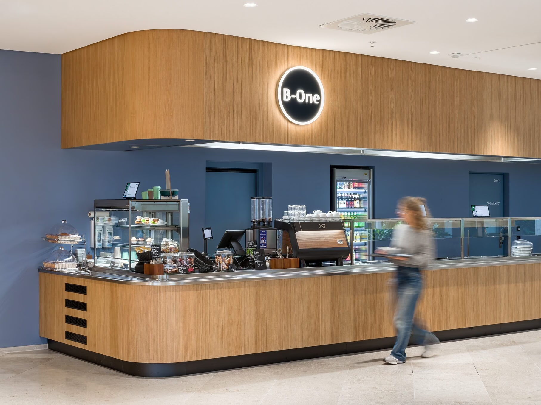
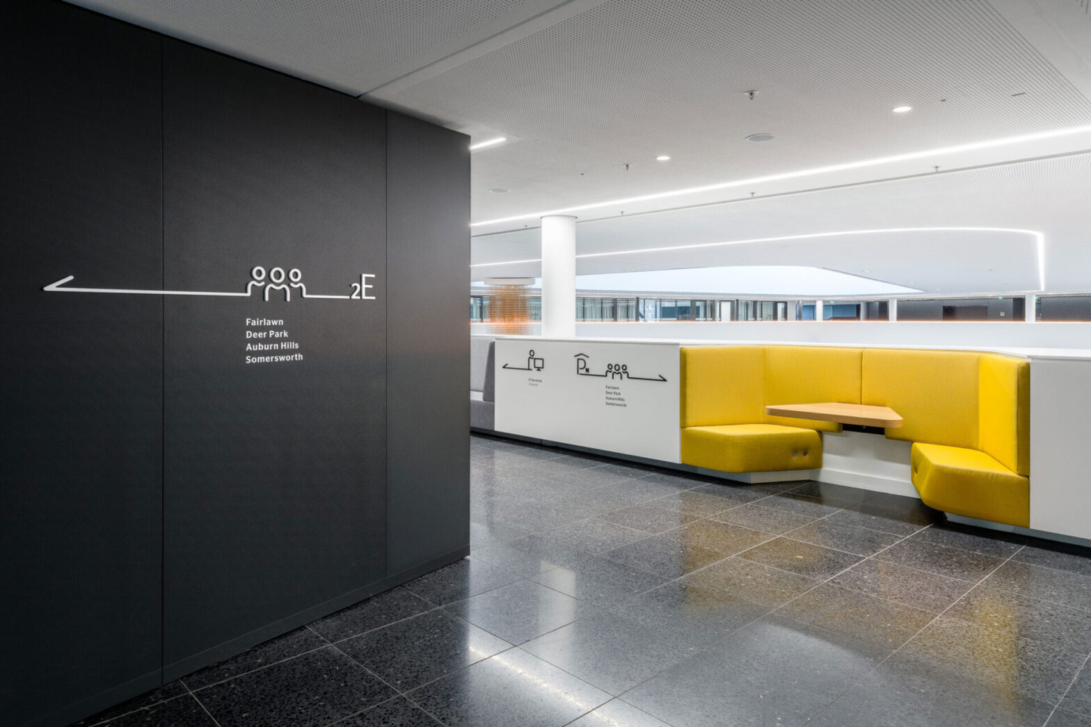
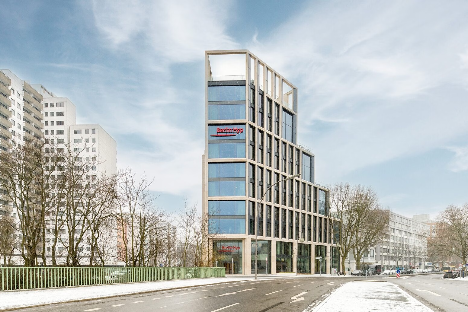
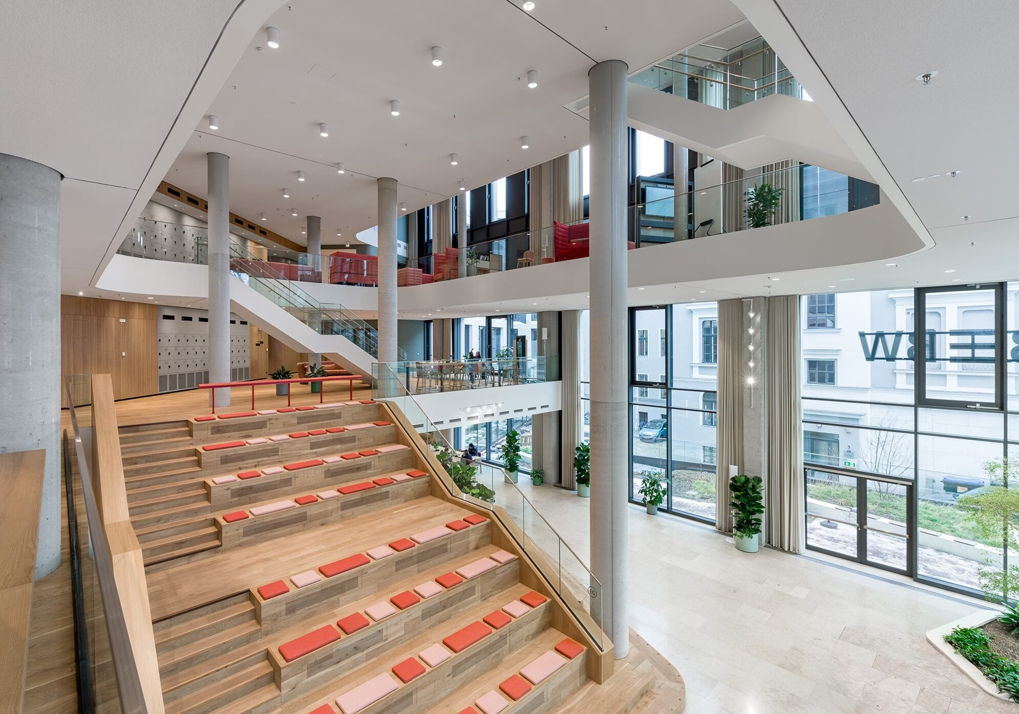
Moniteurs developed the wayfinding system for the new “B-One” headquarters of Berlin Hyp. Designed by C.F. Møller Architects, the sustainable new building on Budapester Straße combines a central “Town Hall” with open activity zones and landscaped outdoor terraces. The building’s stepped profile is reflected in the meandering wayfinding system, which intuitively guides visitors and employees throughout the building.
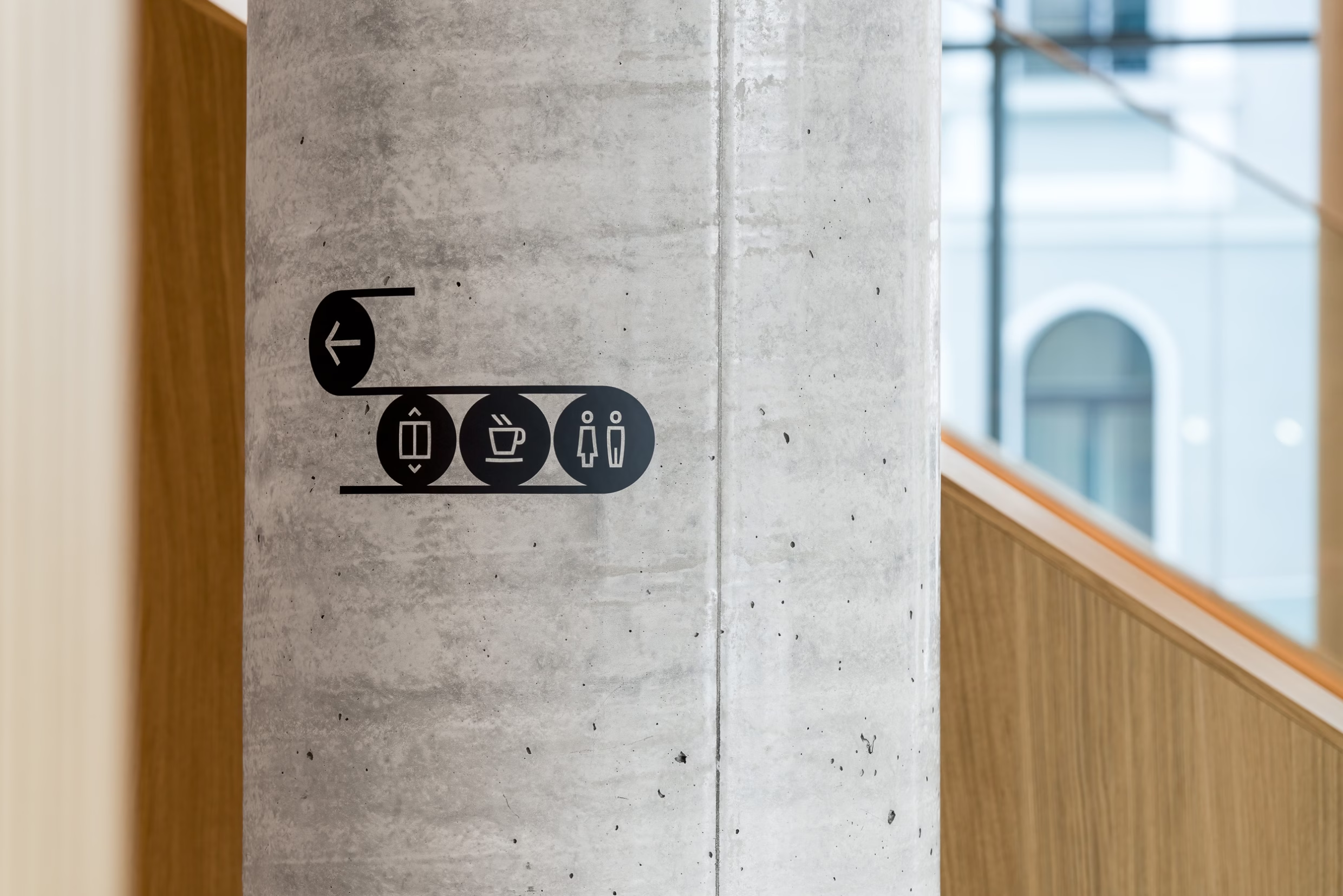
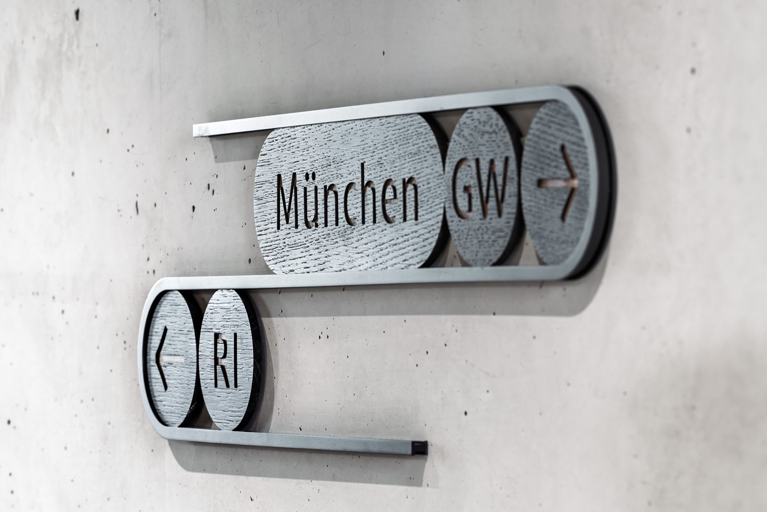
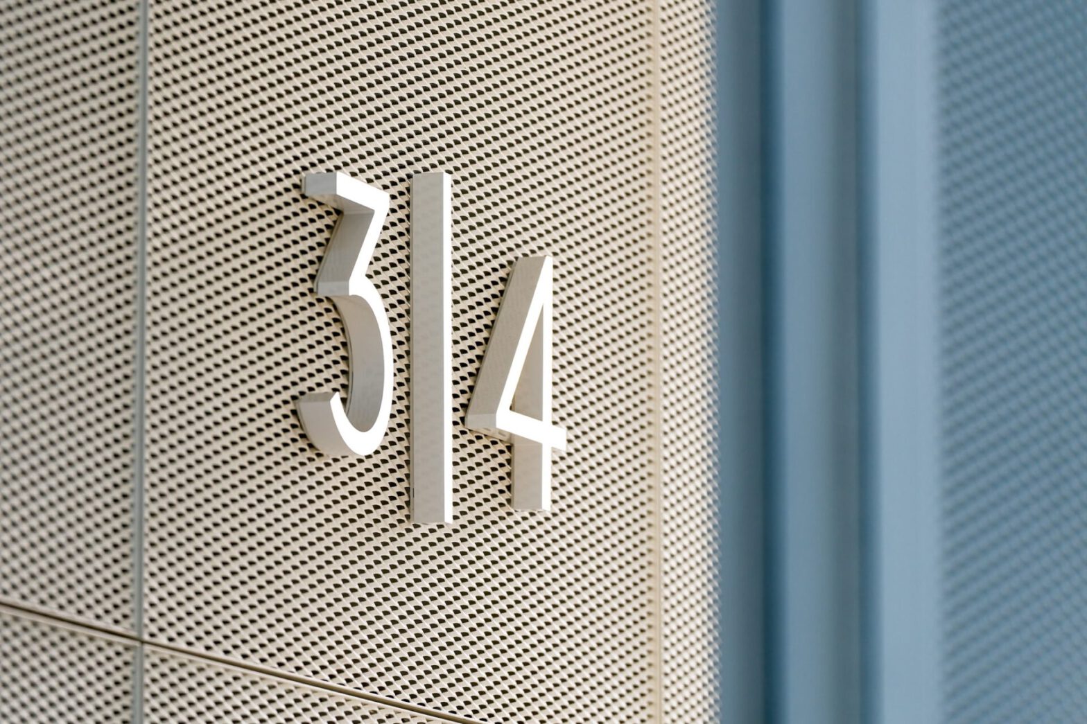
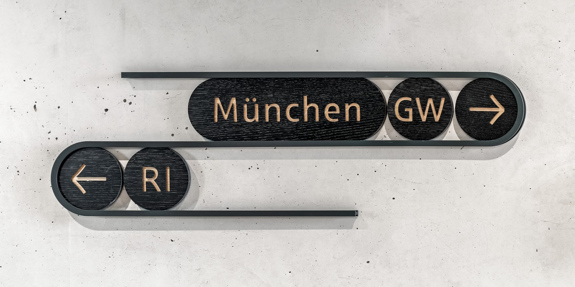
The underlying design concept combines flexibility with the architectural guiding principle of “meandering” through the building. Curved guide rails and painted wooden discs with engraved lettering echo the architectural language, seamlessly integrating the wayfinding system into the interior design.
Gebäudeleitsystem
Berlin
Client
Berlin Hyp AG
Architecture
C.F. Møller Architects
Area
19.000 qm
Photos
Stefan Schilling
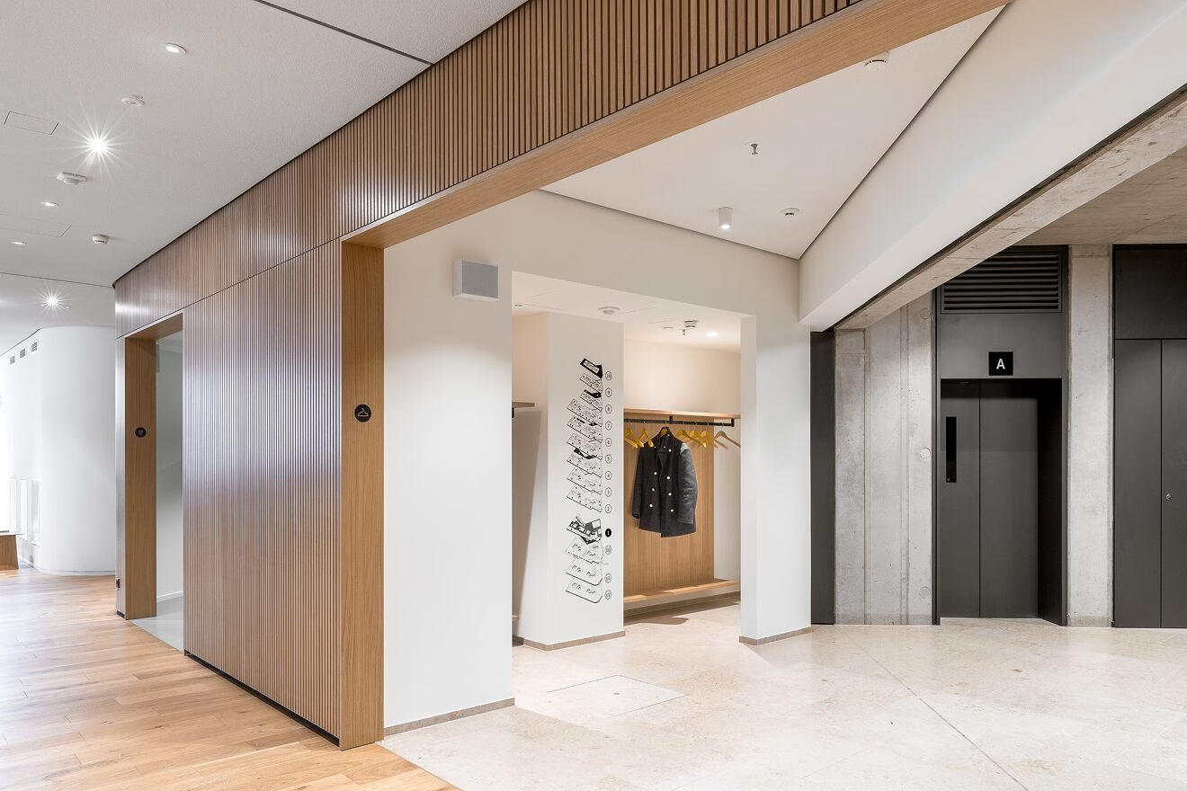
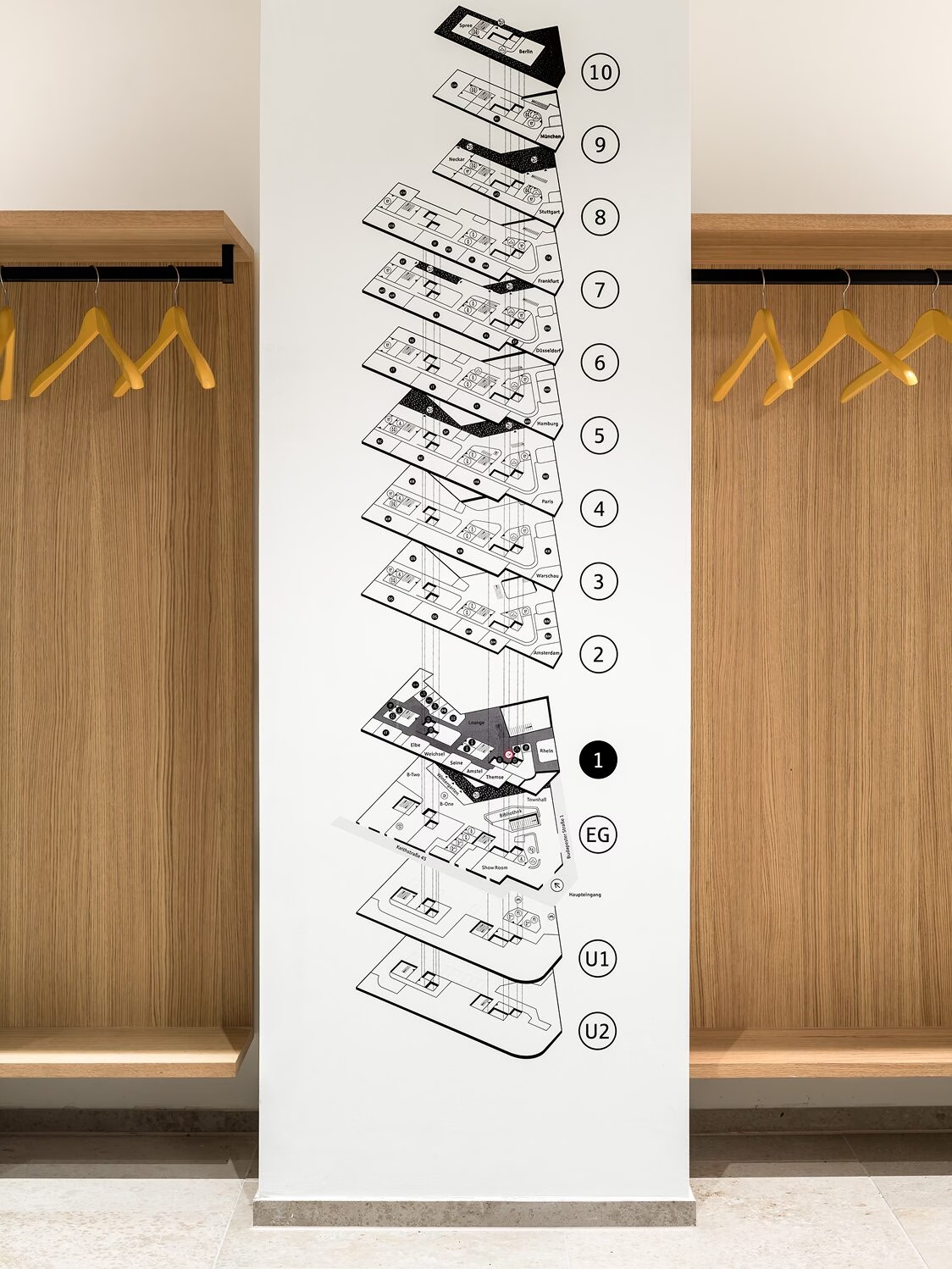
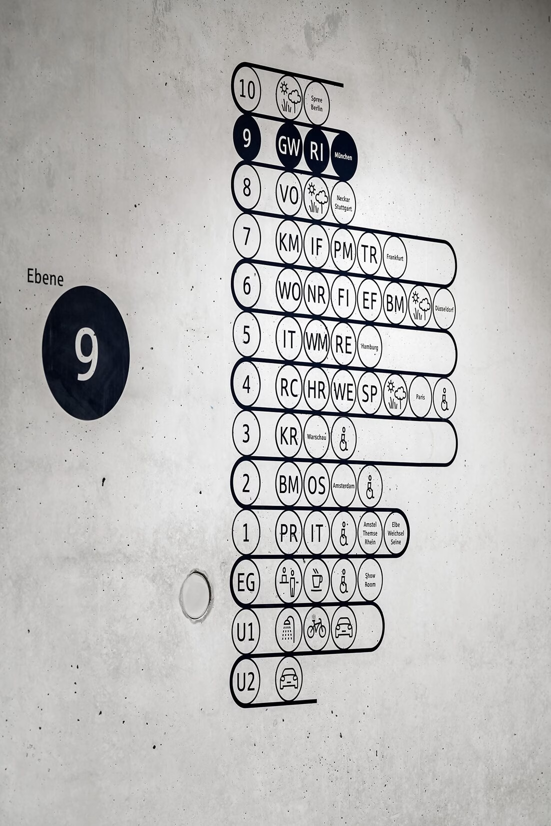
The information systems were also designed for maximum flexibility. Directory boards featuring changing information are conceived as interchangeable film-based solutions, while the central building overview is applied directly to the wall as a high-quality direct print. In this way, the wayfinding system combines functional orientation, design quality, and long-term adaptability within a cohesive overall concept.
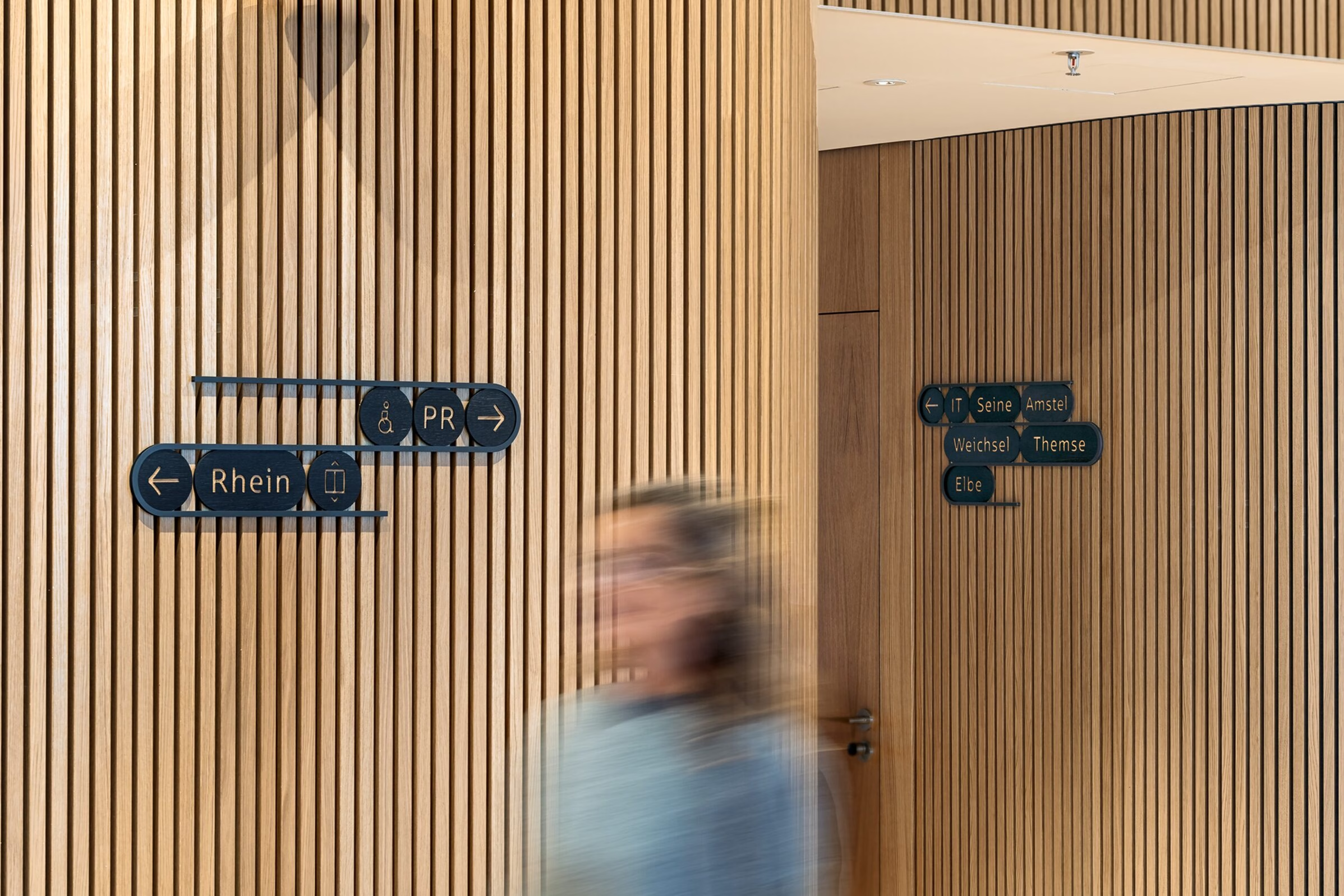
An independent naming system was developed for the smaller meeting rooms: the rooms are named after cities and their corresponding rivers in which Berlin Hyp operates. The meeting room names are displayed in full within oval-shaped signs, while abbreviations and pictograms appear on circular discs.
The typography was consistently adopted from the existing corporate design. Complementing it, a set of bespoke pictograms was developed, formally integrating with the overall design concept.