Orange Ocean
Corporate Design
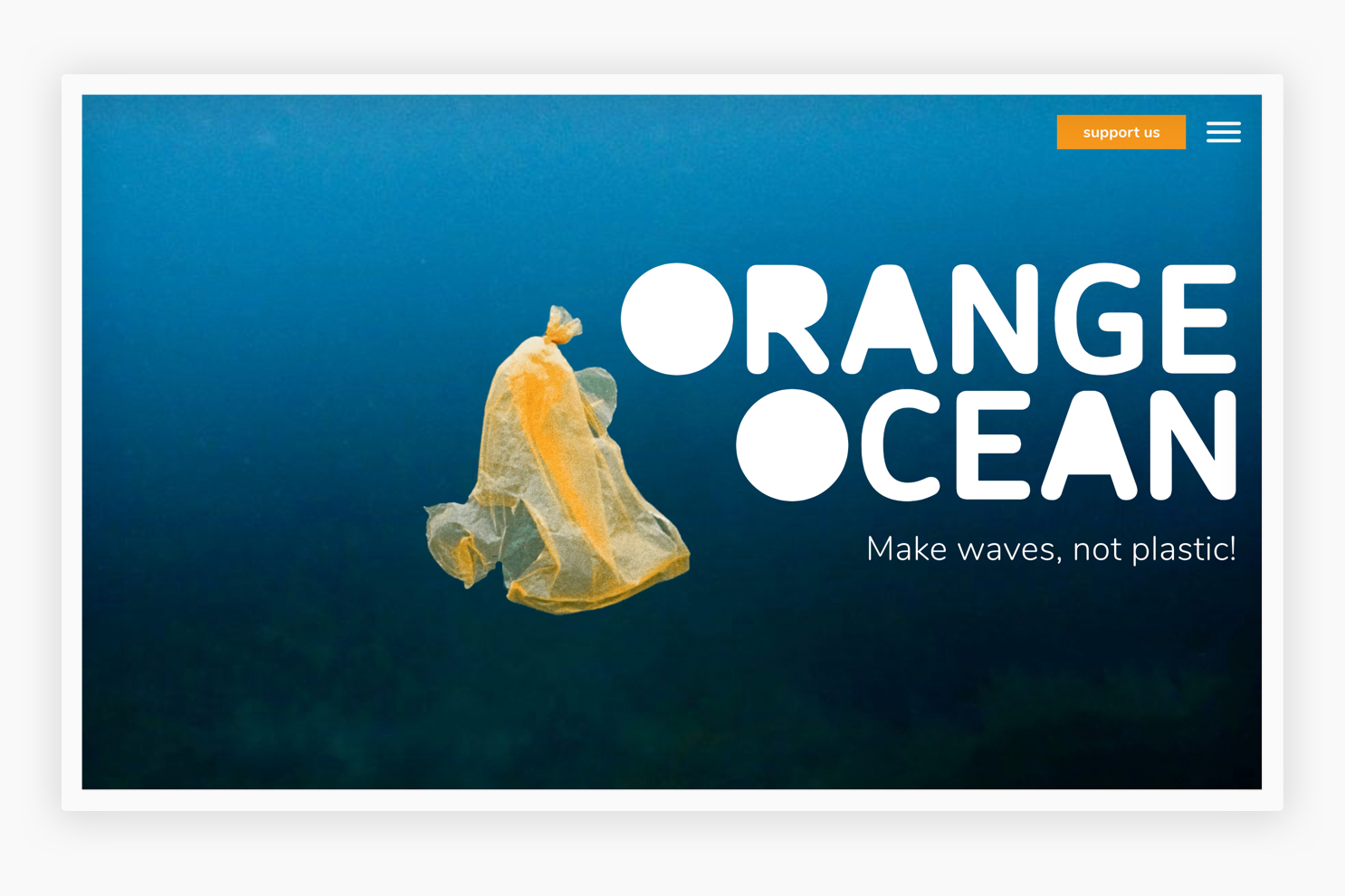
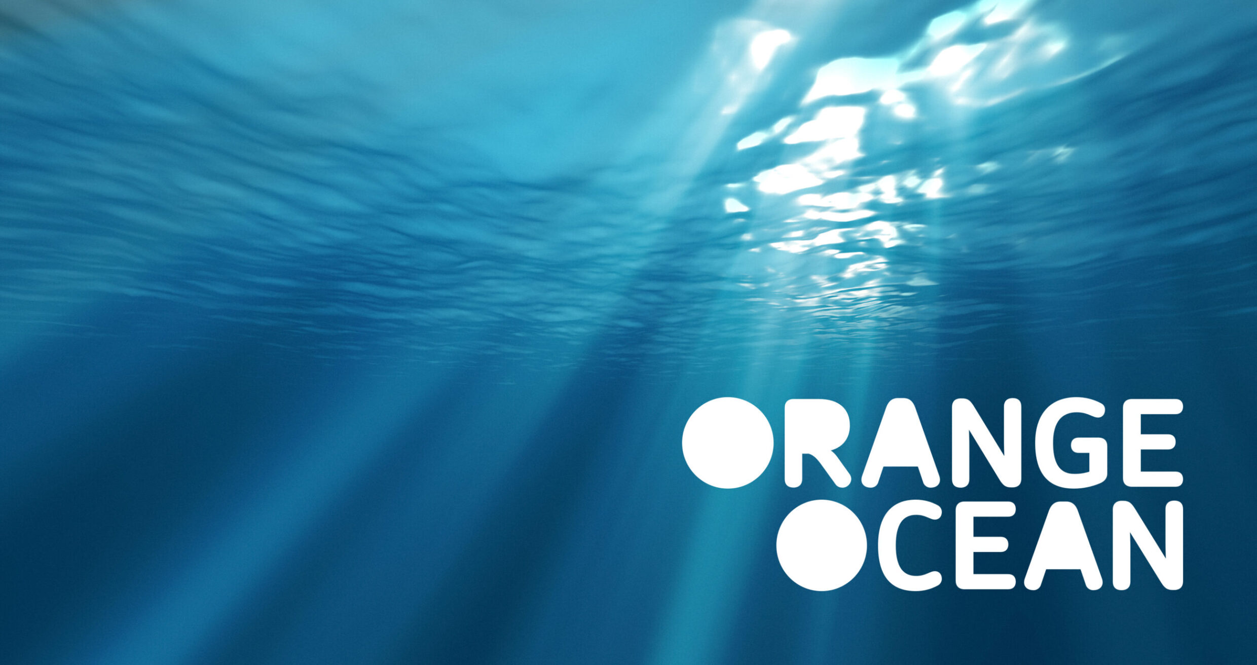
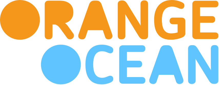
The pollution of the oceans by plastic waste is an issue that concerns us all. Moniteurs is part of this challenge and advised Orange Ocean on strategy and design. The name becomes a word/figurative mark – clear and memorable. The spaces in the letters are filled in, referencing the plastic carpet theme. The typeface picks up the idea of the rounded plastic shapes, the corners rubbed off by water. The problem to be fought is taken into the word mark. This message is reinforced by the color scheme.
Corporate Design
Logo Business Stationery
2018
Client
Orange Ocean e.V.
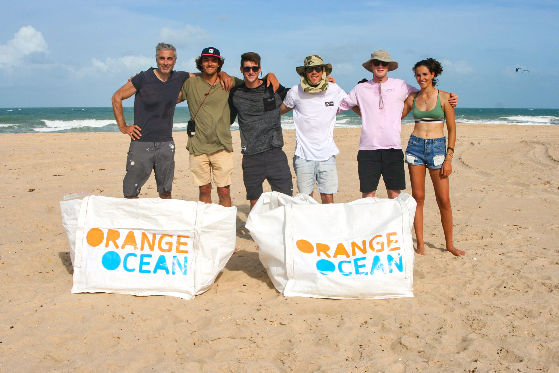
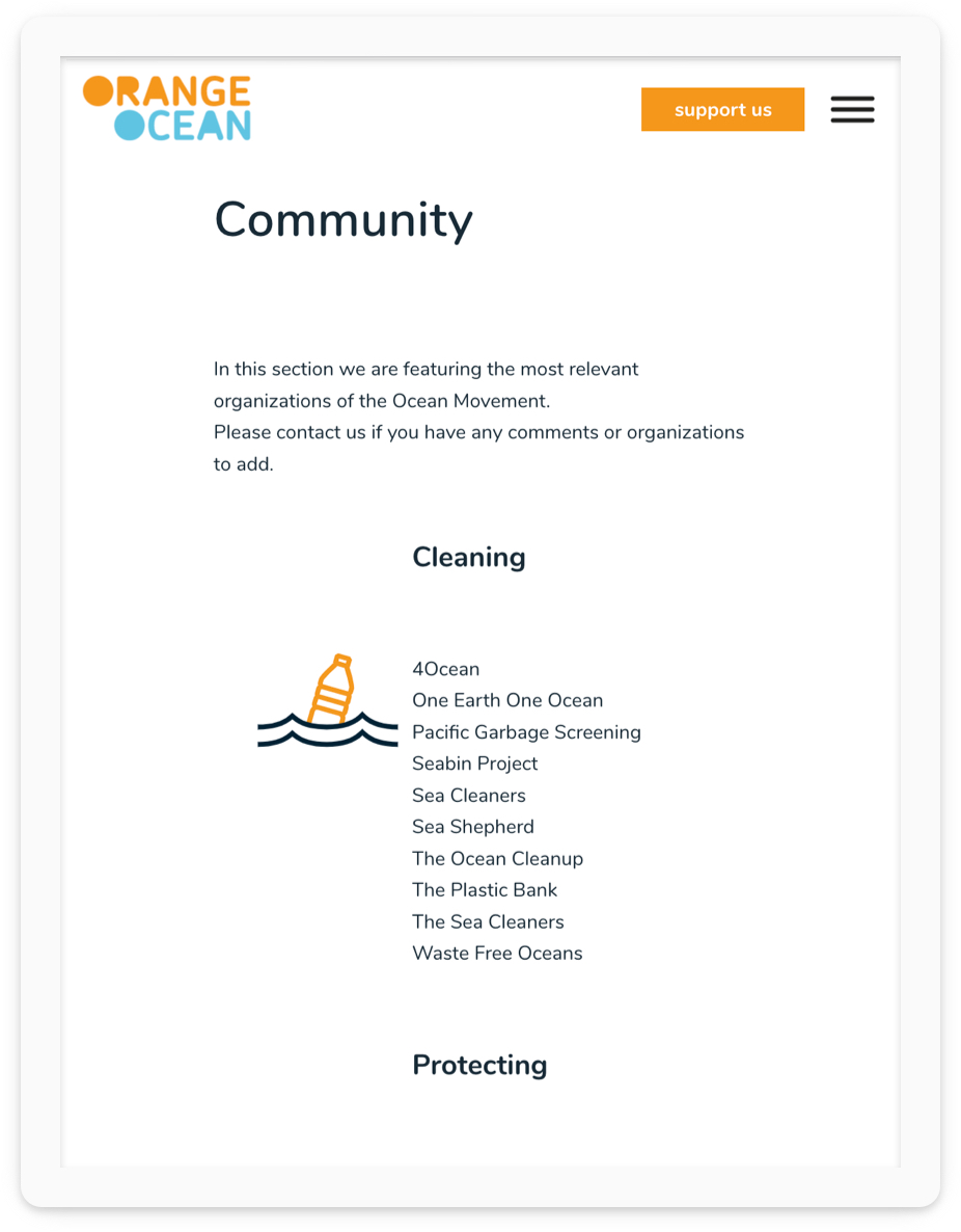
Orange Ocean networks stakeholders from industry, green tech, research and NGOs on the website designed and implemented by Moniteurs and sets up a media forum that covers all relevant topics relating to the protection of the oceans in order to provide consumers with the best possible information.
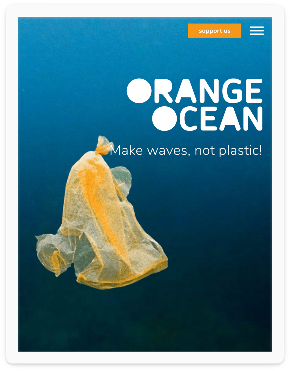
Further sub-word/image brands can be derived from the design grid of the main brand. This allows the various Orange Ocean projects to be communicated together.
