schlaich bergermann partner
Corporate Design
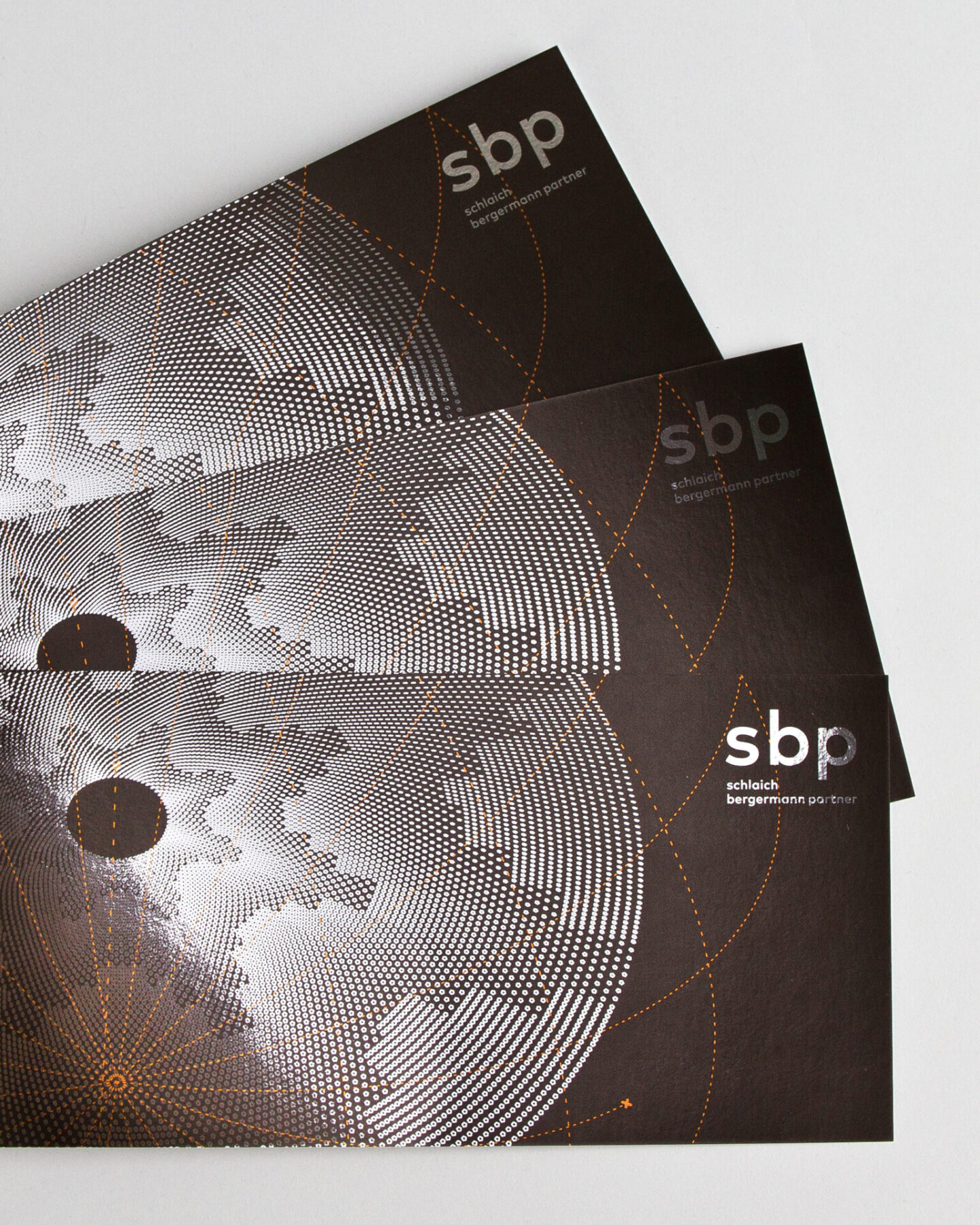
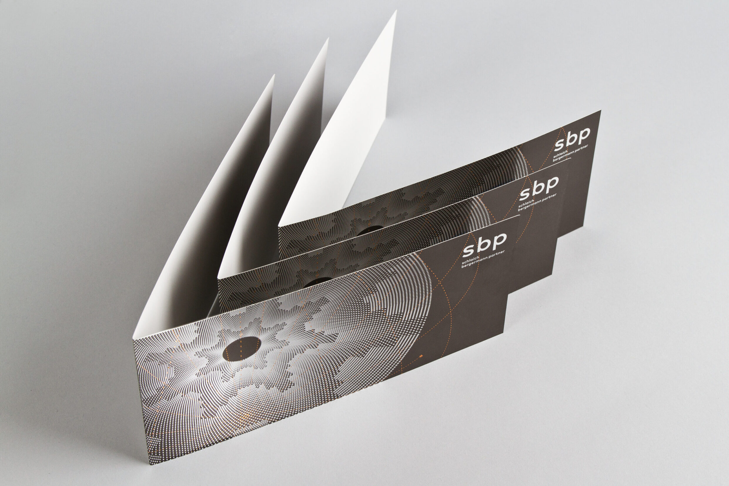
Within the visual concept for the international engineering consultants schlaich bergermann partner, words like construction and complexity versus simplicity are elementary. The logo represents schlaich bergermann partner clearly, memorably and with confidence. The logo, three geometrically constructed and characteristic letters, makes a bold statement. The name, along with its abbreviation, uniquely moulds the brand.
The energy in the design of the present logo radiates lightness, vision, precision and technology, in both analogue and digital forms. The logo will preserve its style, as it is no longer tied to the text. The swing of the letters is free and graceful. Logo – word mark and lettering, momentum, text and colour together create the new corporate design.
Corporate Design
Relaunch 2015
Logo Business Stationery Exhibition Catalogues Publications Image Advertising ebook
Client
schlaich bergermann partner GmbH since 1994