Merck
Wayfinding and Orientation System
The science and technology company Merck is expanding its Darmstadt site into a global headquarters. The historic industrial site is turning into a “Merck City”: state-of-the-art infrastructure, a new Innovation Center and new, modern production and office buildings create an innovative working environment for over 10,000 employees. In addition, the family business celebrated its 350-year anniversary at the central, redesigned Emanuel-Merck-Platz in May 2018!
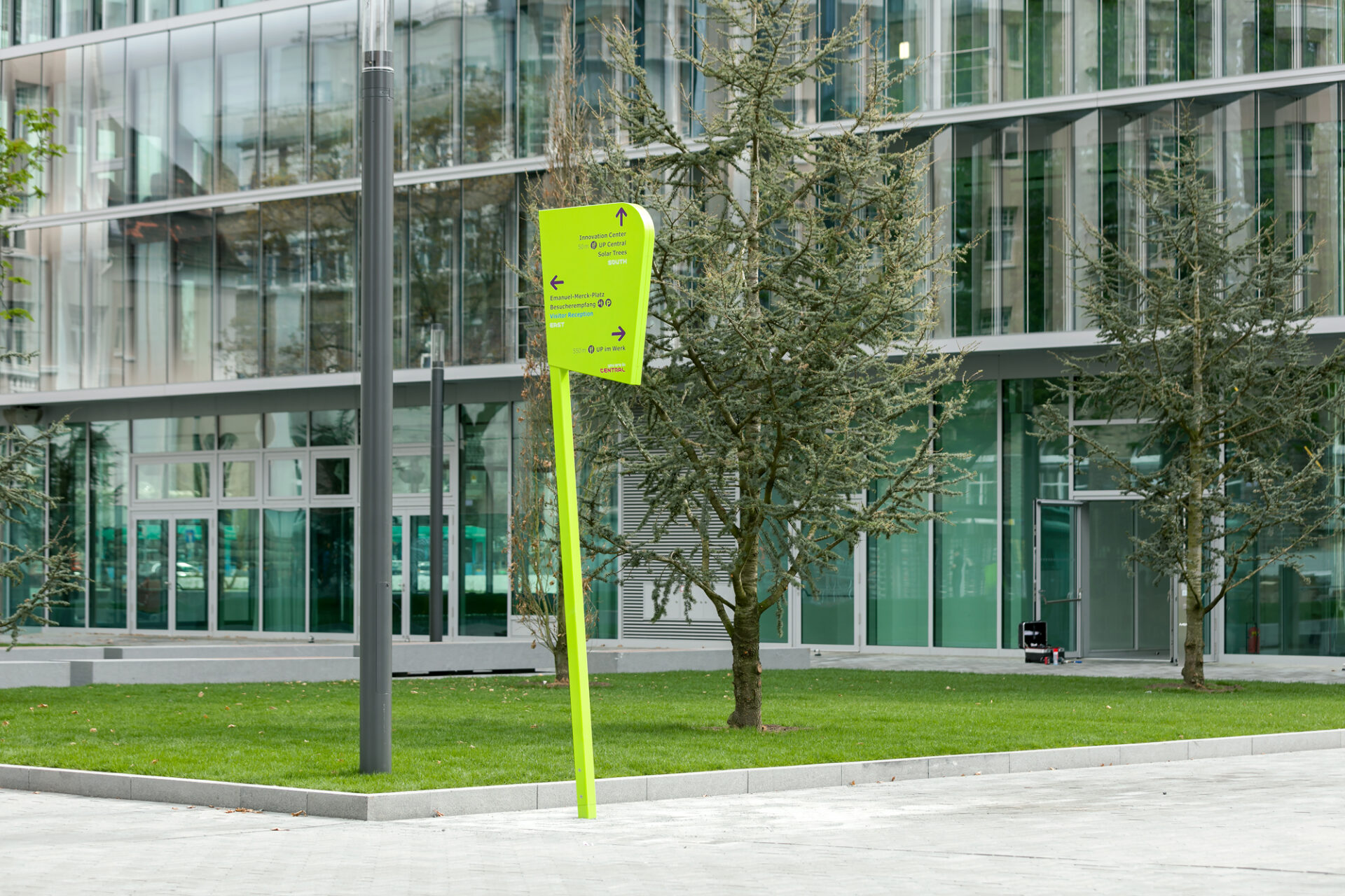
In close cooperation (what we call co-creating!) with Merck and the architecture office HENN, who developed a master plan for the plant and planned the Innovation Center, Moniteurs designed an overarching orientation concept: outdoor and indoor signage as strong brand elements serve as orientation on the Merck plant.
Merck KGaA
Accomplishment
Wayfinding and Orientation System
Indoor and Outdoor
Darmstadt since 2017
Area
125 ha
Architecture
HENN
User
10,000 employees
Photos
Stefan Schilling
Awards
Iconic Awards 2018, Winner

Merck introduced a new brand appearance in 2015 – colourful, with fascinating microbial and cellular structures and a friendly visual language. The company communicates its strengths: openness, innovation, inventiveness, diversity. Moniteurs designed as a basis a stringent content concept with consistent wording and designed “vibrant highlight elements” that not only depict the colours and structures of the new appearance, but also create them. Some outdoor elements have been further functionalised from the already installed steles.
The result is not modular, but an additive system with individual concise “types”. Together they create a diversified family!


co-creation, recreation, lab, telephone booth.