Ostkreuz Campus
Wayfinding system for an urban campus in the new world of work
A comprehensive wayfinding and orientation system has been developed for the new OSTKREUZ CAMPUS office site, which emphasises the principles of modern ‘New Work’ standards and blends harmoniously into the vibrant surroundings of Berlin-Friedrichshain. Along the northern bank of the Spree, a forward-looking space is thus taking shape where work and urban life merge.
Wayfinding system
Berlin
Client
Pandion AG
Architecture
kadawittfeldarchitektur
Area
38.350 sqm
Photos
Stefan Schilling

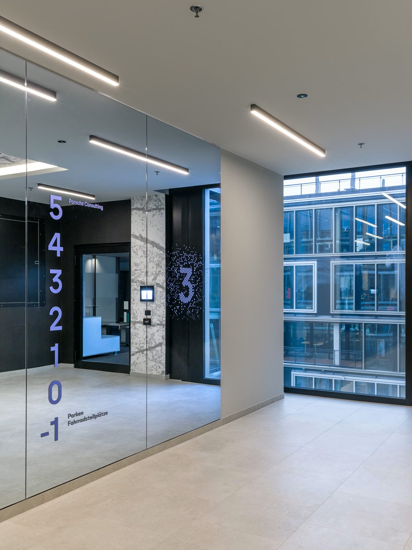
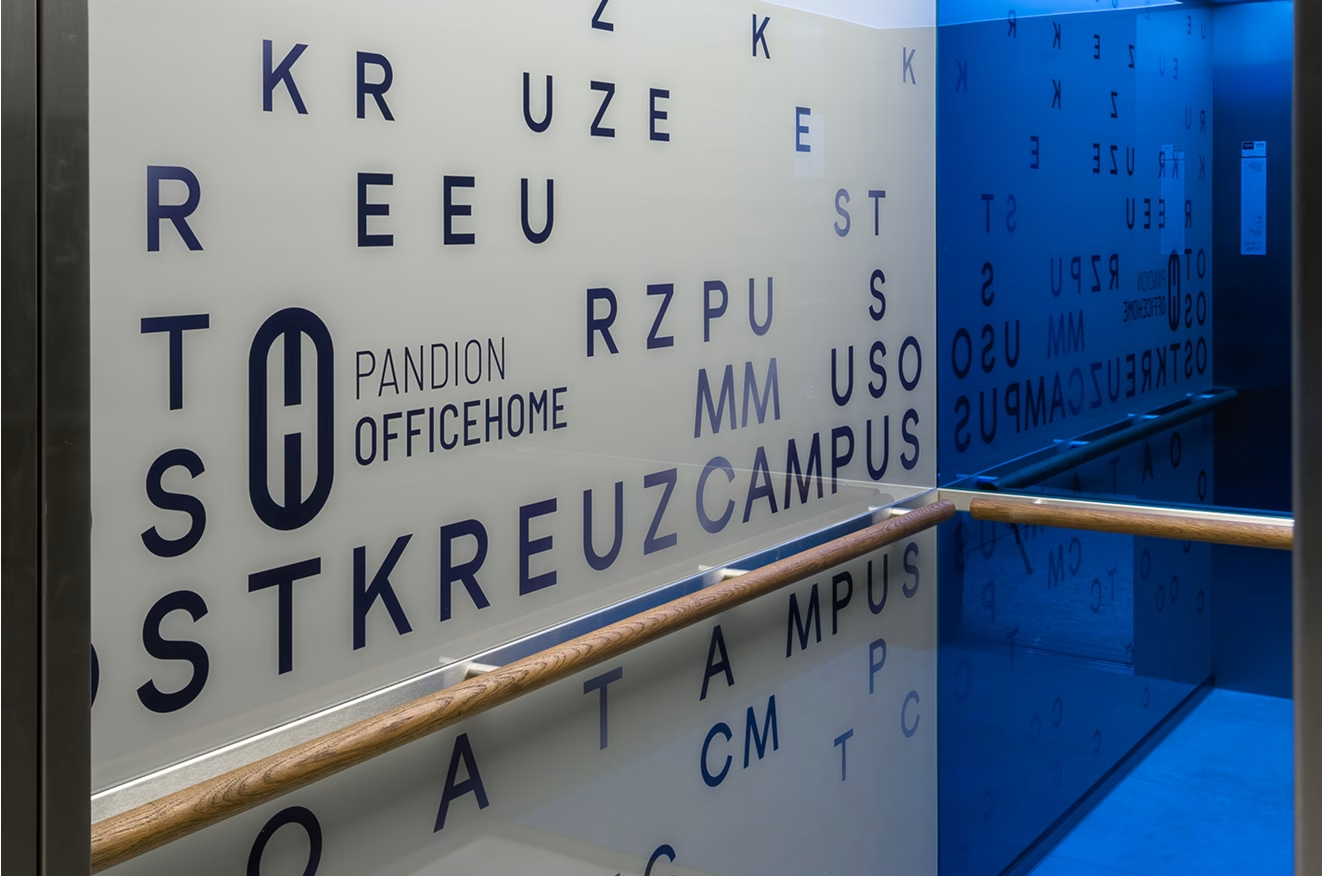
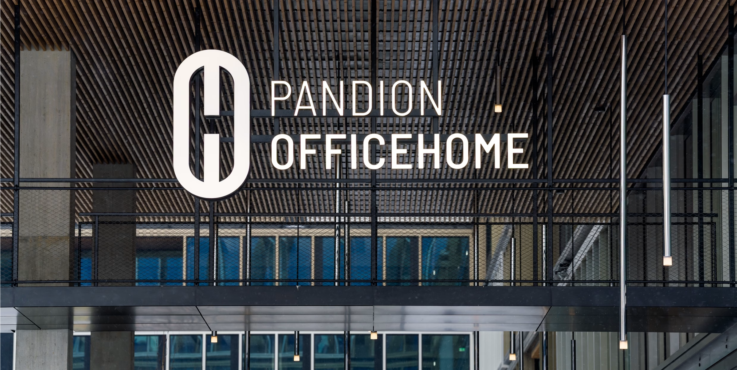
The wayfinding system for the campus, designed by Moniteurs, takes into account the requirements of multi-tenant buildings and combines functionality with design quality. Striking façade signage and high-quality, illuminated wayfinding elements made from durable materials ensure clear wayfinding both indoors and outdoors. These elements are designed to be flexible and can be colour-coordinated to match the respective tenants’ brand identities.
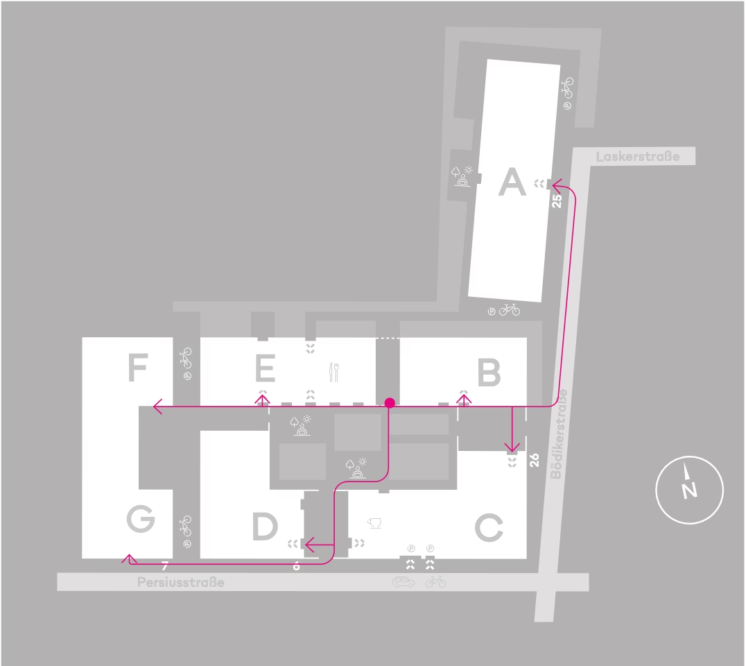

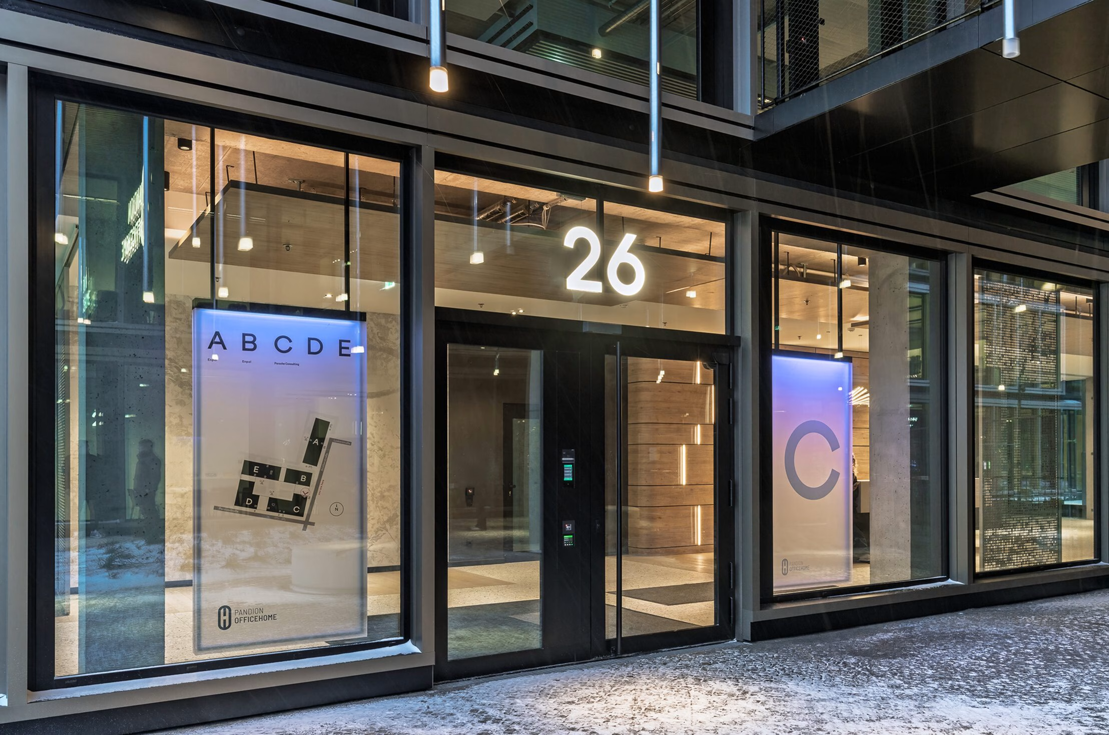
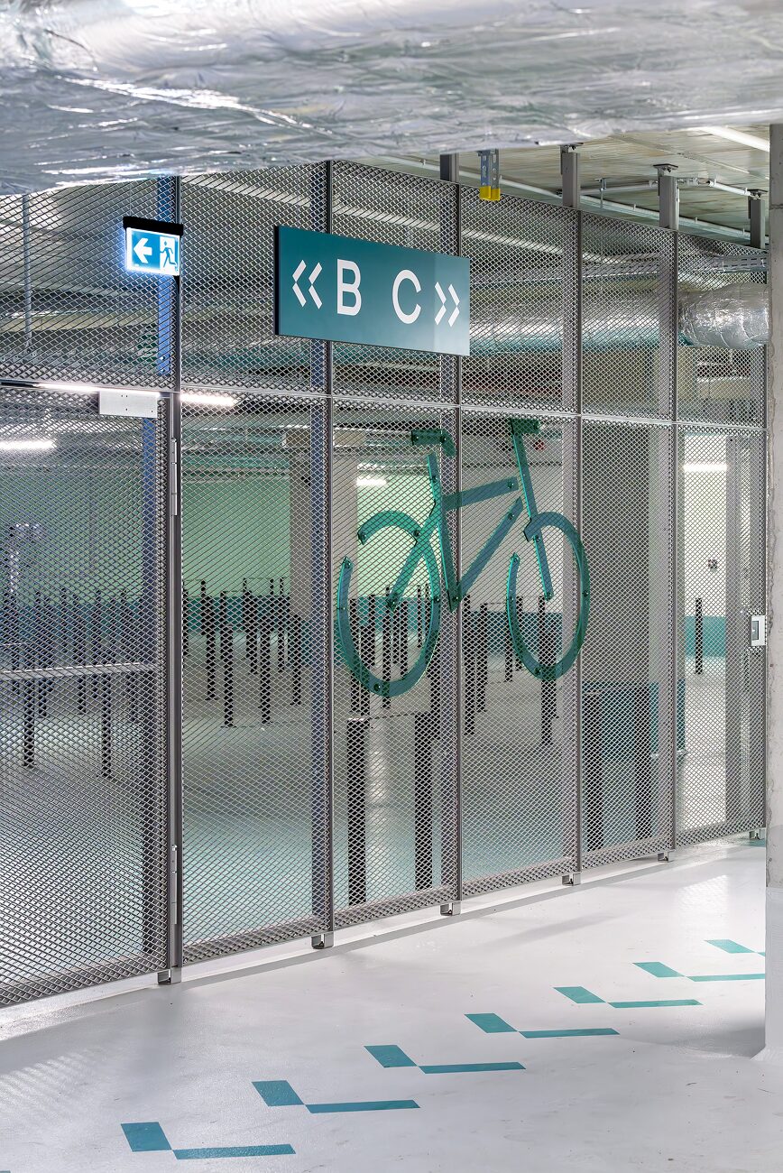
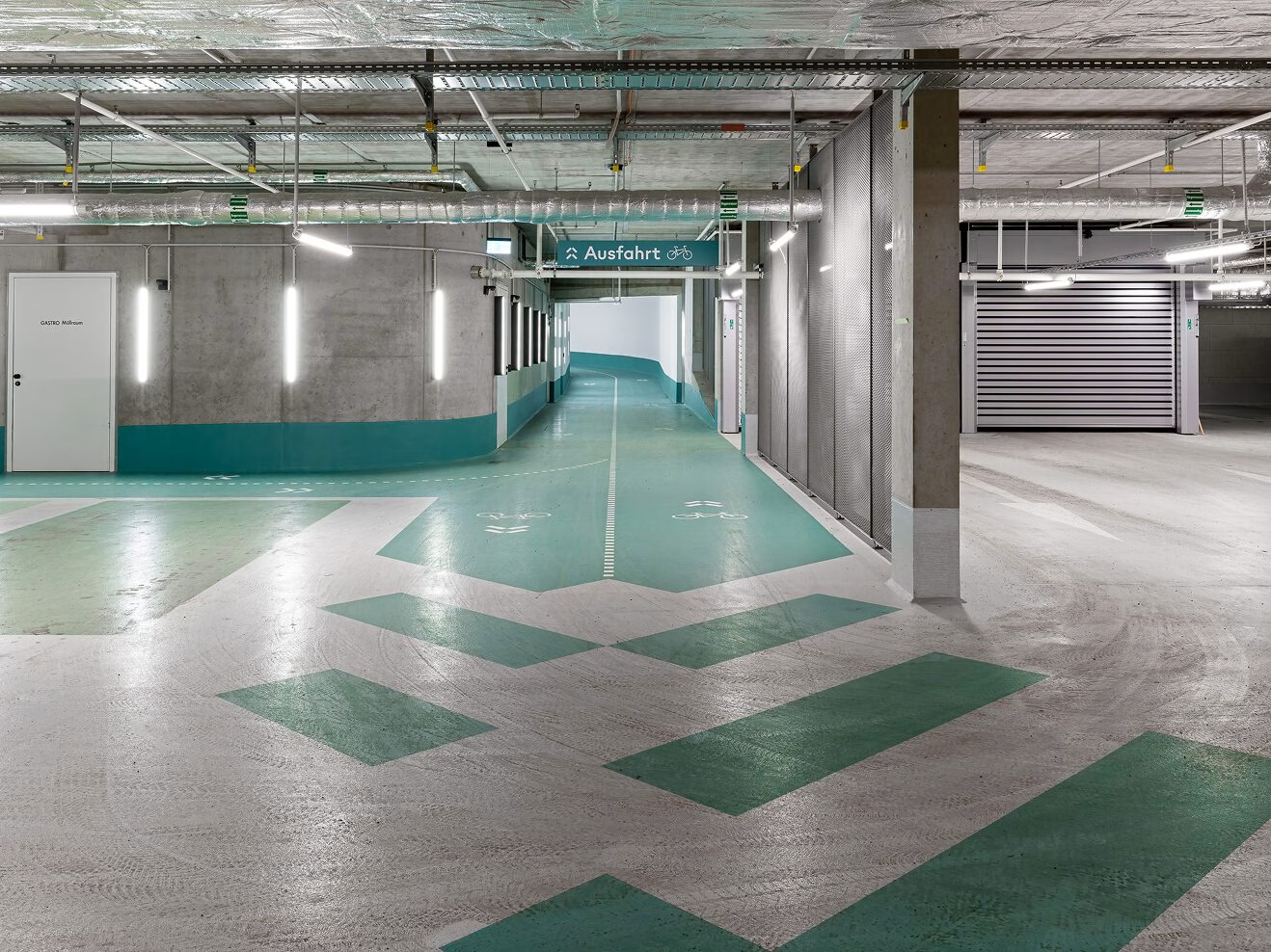
The system is complemented by a newly developed family of pictograms that enables intuitive wayfinding throughout the campus – from the office areas to the car park, including the bicycle parking facilities. The result is a coherent, identity-defining wayfinding system that not only supports efficient navigation but also reinforces the campus’s visual character.